Wednesday, 10 April 2013

Justrite Songbird

This fortnight's challenge on Justrite is a sketch. I thought I'd turn the whole thing back to front, so the borders are in the foreground and the main image at the back. Sheri said she'd like to see some background stamps used, and I just love this "Songbird" stamp, so thought it would be perfect for today's card.

"Songbird"

The main image is stamped onto watercolour paper with black archival ink and coloured with Derwent Inktense pencils and a water brush. Lace edge stamps are stamped in versamark onto coloured card before heat-embossing in gold, then cutting with the matching Spellbinders die. Two are made in black and two in red. The main image is matted onto red card and the lace borders adhered with Pinflair glue for some added dimension, overlapping the outer lace borders. The pinflair needs some time to try, so set it aside for half an hour before matting again onto gold and black card.

"Bow, button and stickpins"

My bessie mate Lee gave me these fabulous Oriental looking beads and I turned them into a pair of stickpins, picking the colours to go with the rest of the card. They are fixed behind the bow with some Pinflair (I use a big blob to cover the pointy end of the pins and keep them safe), and another blob of Pinflair is used to fix the button in front of the bow. This button had a shank that was removed with a pair of wire cutters so it would sit flat.

Ingredients:
Justrite stamp sets: Songbird, Classic Art Deco Lace Edges One, Large Fancy Sentiments
Dies: Spellbinders Classic Edges One
Ink pads: Ranger Archival Jet Black, Versamark clear
Colouring: Derwent Inktense Pencils, 24 set & detail water brush
Embossing powders: Stampendous Pirate Gold, Stampendous Clear Detail
Cardstock: red 300gsm, black 300gsm, gold 300gsm
Watercolour paper
Ribbon, button & handmade stickpins
Adhesives: Pinflair dimensional glue, PVA, Glossy Accents

Entered for the following challenge:
Justrite Friday Sketch Challenge 94

What? You're still here? You want more????


OK then, here are two others I made in different colourways using the same design :-)

"Sepia"

This is actually the first one I made, using just the Derwent "Willow" colouring and  Sepia archival ink pad for stamping. It gives a really soft, vintage look. The gorgeous brown / gold ribbon came from my local craft shop. I diecut a label with the sentiment for this one, but in the other two cards the sentiment is stamped straight onto the background. I prefer the simpler design.

"Teenage Girl"

I thought this fuchsia and pretty blue colour scheme would work well for a teenage girl, but it also happens to be the colour scheme my mil loves best (hello Martha!). Have a lovely, Sunny day everyone :-)

Monday, 8 April 2013

Feathered Friends

This week, Simon Says Stamp and Show...Fly. I cheered when I saw the theme. My favourite subject is nature and especially birds, so here's an Easter card.

"An Easter Card"

This card has the standard book card construction.

"Left Hand Inside Panel"

The background for both panels has strips of lace. I can't bear to throw anything away, so these were odds and ends in my lace box that were too small to use for anything else. Tim Holtz' Seasonal paper stash provided the scene in the frame. The frame is decorated with gold metallic rub-on wax.

"Chirpy"

My husband has lots of girlfriends. Don't worry, they all have feathers! He keeps pet hens and also has a couple of pet cockerels. His favourite pet cockerel is called Chirpy, and this Graphics Fairy image is the spitting image of him (Chirpy that is, not my husband :-). I printed a few copies and cut out layers to decoupage. The edge of the feathers is fringed by taking short snips with a sharp pair of scissors, and all the edges are coloured with distress markers to get rid of any white bits.

"Right Hand Inside Panel"

The pages are rubbed with more of the metallic wax to match the frame on the left hand panel. The book aperture is filled with flowers and some feathers provide extra interest. That beautiful feather peeping out at the top is from one of our Barnevelder hens. They have the most gorgeous gold tinges to their feathers. If you want to see pictures of our hens, check out my husband's blog.

"Front Cover"

The panel on the front cover was made using modelling paste and a feather stencil. Once the paste was dry, I rubbed more of the gold metallic wax onto the panel and matted it onto the front cover of the book card.

Ingredients:
Tim Holtz' paper stash: Seasonal
Graphics Fairy image
Spellbinders Antique Frame and Accents
Dreamweaver stencil - feather
modelling paste
gold metallic wax rub-on
cardstock: brown 300gsm, white 220gsm
assortment of feathers, dried flowers, paper flowers
scraps of lace
adhesives: PVA, Pinflair, Glossy Accents

Entered for the following challenge:
Simon Says Stamp and Show...Fly

Saturday, 6 April 2013

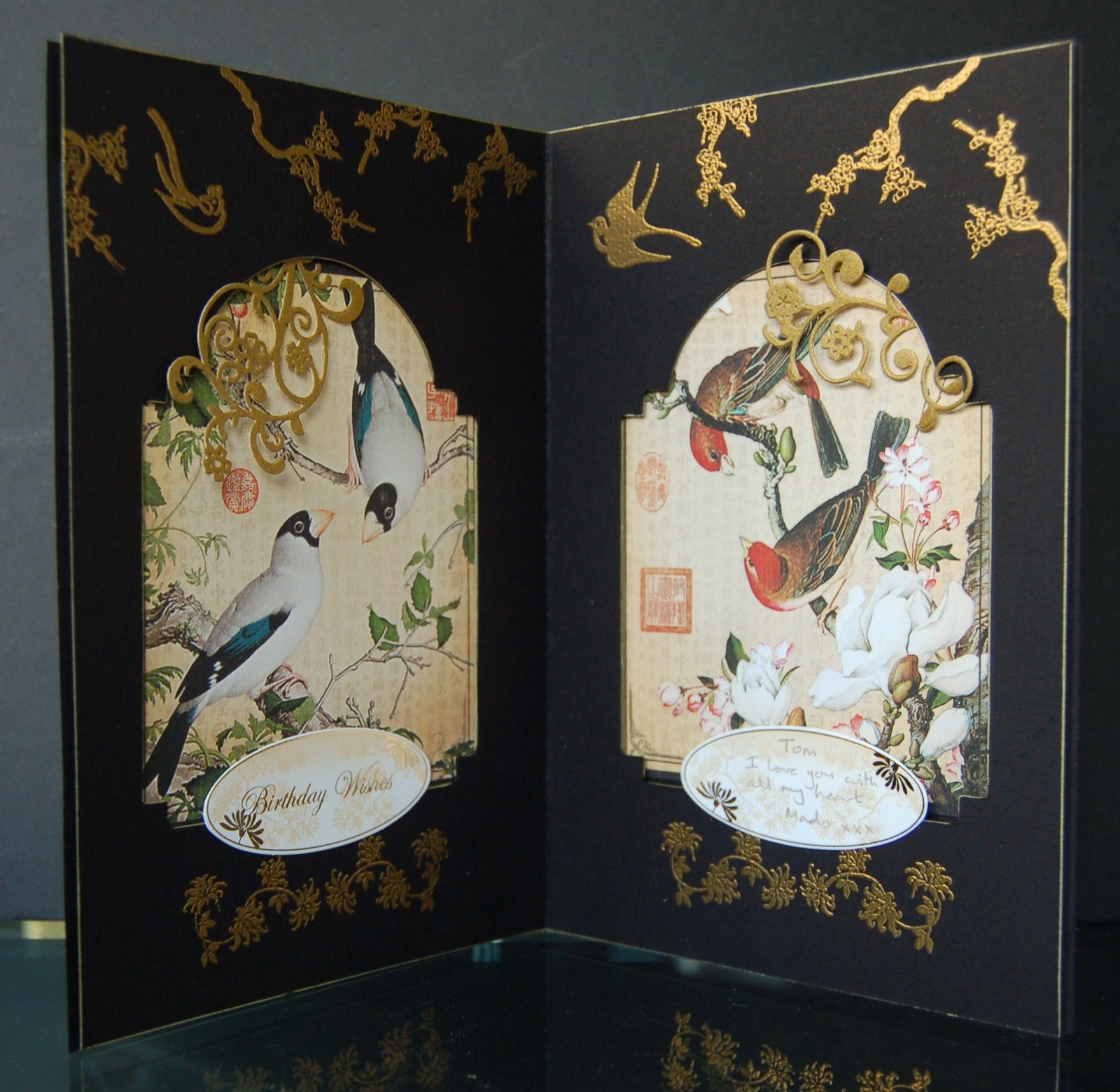
Oriental Double Inside Aperture Card Tutorial

I finally found it! What? You know, the card that I made for my husband's birthday that I hid so well I lost it...

"Oriental Double Inside Aperture Card"

My husband loves birds, no not those, the feathered variety :-) I knew he'd love these panels from Graphic45's Birdsong collection and thought a double aperture card was the perfect way to showcase them.

"Fixing the patterned paper panels"

Starting off with two A4 pieces of thick card, score a double line down the centre of one of the panels (dividing it into 2 x A5 sides with a thin gutter between them). Crease both the lines to make a thin book cover, then fix the patterned paper in place with PVA and surround with double sided foam tape.

"Cutting the apertures"

If, like me, you only have one of the smaller diecutting machines, you may need to score and fold the other piece of card in half and cut both the apertures at the same time. If so, you will probably need to use a steel rule die to get a good cut (I use the Sizzix Bigz dies for this). After cutting, the card is decorated by stamping and heat-embossing in gold, then both pieces of card are lined up and joined together with the foam tape. The thin gutter helps the card to close properly, which would otherwise prove difficult because of the thickness of the foam tape.

"Adding diecut decoration"

Some flourishes are cut from antiqued gold card and fixed in place by gluing the tails beneath the aperture.

"Adding sentiment panels"

 These sentiment panels from Papermania's Oriental collection are just perfect.

"Front cover"

Another panel of the Graphic45 papers is added to the front cover, along with some Chinese characters stamped and heat-embossed in gold to wish my husband wealth, harmony, love and happiness.

Ingredients:
Graphic45 Birdsong 8" x 8" paper pad
Papermania Oriental Treasure stamp sets & sentiments
Artemio stamp set - Chinese Vases
Versamark ink pad
Stampendous embossing powder, Pirate Gold
Spellbinders Die D-Lites, Fantastic Flourish One
Sizzix Bigz M&S Vintage Cabinet die
Aquamarker, gold (for edging)
Cardstock: black 300gsm
Adhesives: PVA, Pinflair, Foam Tape


Entered for the following challenge:
Simon Says Stamp and Show...April 1...A Very Strict Challenge


Tuesday, 26 March 2013

A Box of Inspiration

Showing you this one feels a bit like baring my soul. There's a lot of me in this box, so I hope you like it.

"A box of inspiration"

There are so many gorgeous quotes stamps about, but my favourites are these from IndigoBlu.

"Let Your Soul and Spirit Fly"

This little box helps me out when I'm feeling sorry for myself.

"Love to Create"

It started out as a cheap £3 blank wooden treasure chest.

"Discover Your Passion"

It's coloured with distress stains, overstamped in archival inks, then has inked diecuts stuck on (I love this tree in the corner). The whole thing was finally coated in multiple layers of clear embossing powder. Originally, I'd intended to embed gems and seed beads into the embossing, but I changed my mind and left it like this, just inking the edges with a gold aquamarker and adding some glass pebbles for feet.

"Inside"

The inside of the box is decorated but not embossed.

"Inspiration"

And here's my inspiration... "Courage, Determination, Strength. That's What Little Girls are Made of".

Ingredients:
IndigoBlu stamp set "Discover Your Passion"
Marianne dies: Bird with Branch (small), Bird with Branch (large), tree
Distress Stains - including Tumbled Glass, Picket Fence
Distress Ink Pads - Tumbled Glass, Broken China, Chipped Sapphire, Peacock Feathers
Archival Ink Pad -  Cobalt Blue
Versamark Ink Pad
gold aquamarker
UTEE
glass pebbles
adhesives: Glossy accents, Claudine Hellmuth matt multi-medium
cheap, wooden treasure chest

Entered for the following challenges:
Simon Says Stamp and Show - Quotable
IndigoBlu - Words and Phrases

Sunday, 24 March 2013

Simon Says Stamp and Show... Water

Last Sunday was St. Patrick's day and to celebrate we spent a wonderful weekend on the Inishowen peninsula in Donegal. On the Sunday morning we drove up to the car park at Malin Head and I fished out a cheap set of watercolours and had my first go at painting.

Now Malin Head is about as remote a part of this island as you can get and Tom and I were just wondering what we were going to do about lunch when the strangest thing happened. A man with a van turned up. He opened up the side of the van and there was a state of the art espresso machine, complete with oodles of handbaked fresh cakes. Next thing, cars arrived out of nowhere and soon the whole place was buzzing. MMmmm, I can honestly say that was the best cappuchino I ever tasted, and his homemade ginger cake was glorious. Can't promise the man will be there every Sunday, but if you're ever in the area it's worth a try :-)

"Water - a Weekend in Donegal"

So back to today's card. When I saw this week's theme at SSS&S was water, I had to make use of one of my "paintings" of Donegal (I use the term in the loosest sense of the word lol!). I scanned the one I liked the best and printed it twice onto A6 card (roughly 6" x 4" for my American friends ;-)).

"View from car park at Malin Head"

What with the arrival of the coffee, I never got time to finish the painting, so my white bits were added onto the print before matting on silver and sticking to the left hand side of a book card blank.

"Lighthouse"


The other copy was overstamped with this fabulous lighthouse scene from Chocolate Baroque using archival ink and carefully lining up the horizons. I stamped a second copy of the scene onto watercolour paper and watercoloured with distress inks, cutting out the lighthouse and sailing ship and adhering over the stamped images in the print using Pinflair glue for some added dimension. Distress inks and a white gel pen were used to add colour and detail to the picture, then I gilded the whole of the foreground and the frame of the bookcard using IndigoBlu flitter glu and gilding flakes. Lastly, lashings of Pinflair dimensional glue were dribbled along the bottom of the book card and I added loads of sequins (mostly silver with a few blue), followed by more glue and lots of seed beads.

Pebbles that you pick up off the beach are always prettier when they are wet with the sea water than when you get them home and they've dried out don't you think? I hope I've captured the feeling of a wet seashore. I could add lots more to this card, but thought I'd leave this one simple for once.

Ingredients:
watercolour set and a weekend in Donegal, or you can nick my "painting" below ;-)
Chocolate Baroque stamp set: Seashore Scenes
distress ink markers (I used a lot, but including Pumice Stone and Tumbled Glass)
IndigoBlu flitter glu and Winter Dawn gilding flakes
Pinflair dimensional glue
sequins & seed beads
bailer twine for card closure
cardstock: grey 300gsm, white 220gsm, watercolour paper

"St. Patrick's day off Malin Head" by Izzwizz
My first ever painting

Entered for the following challenge:
Simon Says Stamp and Show... Water

Friday, 15 March 2013

Tim Holtz' 12 Tags of 2013... March

This is my take on Tim's March tag.

"Easter Bunny"


The larger Bunny Bigz die is used to cut the aperture, and the card is then passed through the Ornamental M&S die to shape the top and bottom edges before inking and stamping. Images from the Seasonal stash paper pad are fixed benhind the aperture and this piece mounted with foam for extra dimension. The background paper is cut to size and the edges inked, then various diecuts are inked to match and fixed to the bottom edge of the card. A couple of paper flowers are added to the right hand side, their stalks glued in with glossy accents.

"Easter Card"

I liked the first one, but wanted to make one with an Easter sentiment so moved things round a bit and made another! Have a good weekend, and happy St. Patrick's day on Sunday. xx

Ingredients:
Tim SizzixHoltz Bigz Bunny & Ornamental M&S
Tim Holtz paper stash: Seasonal, Lost and Found
Tim Holtz distress inks: Spun Sugar, Tumbled Glass, Broken China, Bundled Sage, Peeled Paint, Chipped Sapphire
Tim Holtz Stampers Anonymous Spring Sprung
Spellbinders Die D-Lites: Cattails, Flower Burst, Poppy Patch, Fancy Tags

Entered for the Tim Holtz gallery

Thursday, 14 March 2013

Pop Butterflies

The Justrite challenge this fortnight is to make it pop. With Spring in the air, I couldn't resist the butterflies!

"Pop Butterflies"

The large butterfly is diecut from A5 card. A second piece of card is coloured and stamped and placed beneath the aperture. The two pieces of card are adhered with foam tape, and the diecut butterfly is coloured, stamped and replaced in the aperture, lifting the wings for extra dimension. A couple of stick pins are constructed with beads and glued into place to make antennae.

"Side view showing dimension"

The top butterfly is stamped onto the card and again on scrap card, cutting out the second butterfly, colouring and adhering the centre part only, lining up with the original stamped image. The wings are again lifted for added dimension. Small gems are added to the antennae and along the spine of the butterfly.

"Justrite sentiment and frame"

The sentiment and frame are stamped in black archival and heat-embossed with clear, holographic powder before cutting out with the matching die and adhering to the card with foam pads. The flowers are diecut and just the bottom edges layered onto the card with foam pads so the tops are free, can be shaped and look more realistic.

Ingredients:
Justrite stamp set: Grand Sentiments
Technique Tuesday stamp set: Get in Gear
Spellbinders: Resplendent Rectangles
Spellbinders Die D-Lites: Flower Burst
Distress Inks: Peacock Feathers, Shaded Lilac, Squeezed Lemonade
Archival Ink: Jet Black
Embossing powder: Stampendous Kaleidoscope Clear
stickpins, beads
gems
adhesives: foam pads & tape, glossy accents

Entered for the following challenge:
Justrite Friday Challenge 92 - Make it Pop