Wednesday 30 January 2013

Tim Holtz' 12 Tags of 2013...January

Well, this is my version of Tim's January tag. Of course, I turned it into a card.

"12 Tags of 2013...January"

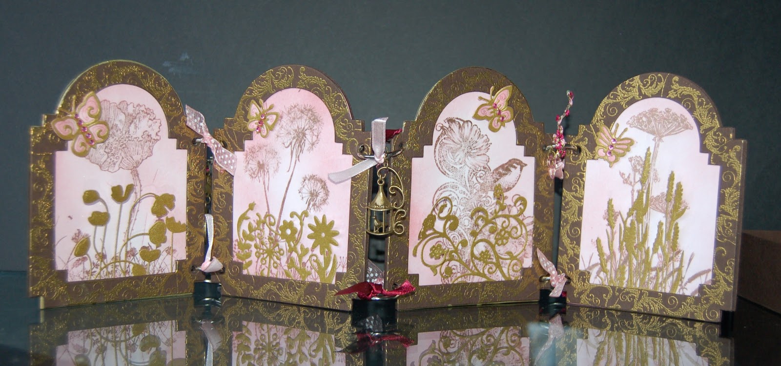
Some foamboard diecuts were used for extra dimension, and I added a couple of watch charms and some chain. The clock hands are foamboard cut from the Weathered Clock die, and the filmstrip is stamped onto acetate using black archival ink then cut out with scissors. There is some matting and layering onto Tim Holtz paper and plenty of distressing. The clip holding the "Time" sentiment is recycled from some Marks and Spencer shirt packaging, the clips are plastic, but resemble metal once dabbed with some silver Adirondack alcohol ink mixative. The foamboard diecuts are dabbed with silver and gold mixatives. The black foamboard showing through makes for a sort of reverse distressing. If you fancy a closer look at anything, just click on the picture to enlarge it.

The sun is making one of its rare appearances here in Northern Ireland this afternoon and it's a welcome sight indeed after all the rain of the last few days. Hope you are all having a Sunny day whatever the weather.

Ingredients:
Tim Holtz paper stash "Lost and Found"
Tim Holtz Sizzix Bigz dies: Gadget Gears, Weathered Clock
Tim Holtz Ranger distress inks Stormy Sky, Iced Spruce, Rusty Hinge, Walnut Stain
Tim Holtz Ranger Adirondack Alcohol ink mixatives: Silver, Gold
Tim Holtz Stampers Anonymous stamp sets: Playful Journey, Lost and Found, Curious Possibilities, Visual Artistry
Screw brads
Watch Charms
Chain
Adhesives: PVA, glossy accents

Monday 21 January 2013

What are you known for?

This week's challenge from Simon Says Stamp and Show is "What are you known for?". Well, I guess I'm known for making vintage cards with dimension, so I'm sharing one of those with you today. It's what I call a screen card, inspired by an old Japanese screen that my grandmother gave me. It has scenes inset with gold leaf and mother of pearl and I can remember lying on my bed in her house when I was very little, spending hours looking at all the detail.

"What are you known for? A Vintage Dimensional Card""

This side has scenes stamped and covered in Perfect Pearls over sponged distress ink backgrounds. The frames are stamped and heat-embossed in gold and the images are decorated with diecut flowers are butterflies.

"First panel close-up"

The diecuts give some added dimension to the card and also cast shadows when the light falls in a certain way.


"Reverse"

 The reverse has the same scenes heat-embossed in gold directly onto the brown cardstock.

"Reverse close-up"

Small lengths of ribbon and charms are tied onto the book-rings joining the panels.

"In the box"

This sentiment makes a great front panel when the card is folded and placed in the box.

"Take the time to walk barefoot in the grass making daisy chains and believe in the beauty of your dreams".

Ingredients:
IndigoBlu stamp sets: Poppy Meadow, Enjoy Life, Clematis Flourish, Nature 1, Wild Meadow
Sizzix Bigz M&S Cabinet & mini Cabinet dies
Spellbinders D-Lites: Poppy Patch, Cattails, Flower Burst, Fantastic Flourish One
Versamark Ink Pad
Stampendous embossing powder: pirate gold
Distress Inks: Tattered Rose, Victorian Velvet
Perfect Pearls: Heirloom Gold
Ribbon, charms
cardstock: brown 300gsm, white 160gsm
adhesives: PVA, Pinflair

Entered for the following challenge:
Simon Says Stamp and Show - What are you known for?

Friday 18 January 2013

Happy Birthday Husband!

Well, it's my husband's birthday soon (as if you hadn't guessed from the title!). I spent a few hours making him a card this week, but I lost it!! After searching for it for over 5 hours, I've given up, admitted defeat and made him another one. If the first one ever turns up, I'll let you know (and put it somewhere a bit more obvious for next year), but until then, here's the totally different replacement.

"Happy Birthday Husband"

It has a bit of a Victorian feel to it, but quite manly I think. Hope he likes it. There is quite a lot of dimension with concentric apertures using the Spellbinders Resplendent Rectangles set, drawing the eye into the heat-embossed sentiment at the centre, and I also used a lot of the dies to emboss rather than cut (click on the picture to enlarge it if you want to see more detail). Each of the pieces of card was mounted with foam tape, then the outermost one was wrapped with brown lace to cover all the edges, and the whole thing mounted onto a piece of brown card with stamped lace edges heat-embossed in gold.

Happy Birthday Husband!

Ingredients:
Justrite Grand Sentiments & Art Deco Lace Edges stamp sets
Spellbinders Resplendent Rectangles
brown lace
cardstock: gold holographic, brown
versamark ink pad
gold embossing powder

Entered for the following challenge:
Simon Says Stamp and Show - Lace Love

Thursday 17 January 2013

Chronology

The docrafts Goody Bag this month had some fabby bits from their new "Chronology" range, and I couldn't resist. This is the first card I made with it:

"Chronology"

The metallic panel is made by embossing mirror card with a cogs folder, then rubbing black acrylic paint into all the recesses using fingers, and finally buffing some of the paint off with a piece of kitchen roll. It gives an oily effect on the gears as well as being great fun :-) Distress inks are sponged around the topper and patterned paper and all the pieces are matted onto black card. The background patterned paper is also matted onto gold to match the gears panel. One of the pocket watches is cut from the paper pad and covered with glossy accents, then fixed on the card with some foam tape to raise it a little.

"Charms"

A pocket watch and key charm are attached to the card via jumprings and a length of chain threaded through an inset eyelet. I attach a large jump ring to the back of the chain after threading it through, to act as a stop for the charms at the required length.

Ingredients:
Chronology 8x8" paper pad & diecut toppers
Cogs and gears embossing folder
cardstock: gold mirri, black 160gsm, white 300gsm
adhesives: foam tape, glossy accents, PVA
eyelet, jumprings, chain, charms
distress inks

Wednesday 16 January 2013

Inky Fingers

Thank you for all the tales of making daisy chains yesterday, I'm so glad to hear that this tradition is alive and well :-) Do you ever get the urge to get your fingers inky? Sometimes, I just love to get all my distress ink pads out and get working with bits of sponge. I just start putting inks down and get a surprise when the card is finished. That's how it was with this one...

"Inky Fingers"

I love the pearlescent shimmer you get from Perfect Pearls powders, that's how I achieved the gold shimmery effect in the background. The songthrush and branches are diecut from white card and coloured with distress inks, with some detail added using distress markers. Finally, the letters are cut from my precious stash of Tim Holtz' papers. We don't use any slug pellets, or any other pesticides for that matter, and consequently have a huge array of birds in our wilderness of a garden, including songthrushes. When my veg patch is suffering, I can always console myself by listening to the birdsong :-)

Ingredients:
Sizzix / Hero Arts stamp set -
Marianne bird & branch die
Tim Holtz "Lost and Found" paper pad
distress ink pads & markers
Perfect Pearls - Heirloom Gold
cardstock: 300gsm white
adhesives: PVA, Pinflair

Entered for the following challenge: Charisma Cardz - Happy Birthday!

Tuesday 15 January 2013

Daisy Chains

Growing up in England in the 1970s there wasn't a lot to do. One of the fun entertainments in those long, hot Summers (they were always long and always hot!) was making daisy chains with a group of friends, all seeing who could make the longest. Then we really did make them into circles and wear them as crowns on our long hair! Many's the time we were chased off the cricket pitch while collecting daisies :-) I wonder if children still learn how to do this? I love this beautiful sentiment from IndigoBlu "Take the time to walk barefoot in the grass making daisy chains & believe in the beauty of your dreams". It reminds me of those days.

"Daisy Chains"

I made this as a birthday card for my best friend. Have to hope she doesn't see it on the blog before her birthday, but I wanted to enter it for this month's Stamping Sensations challenge, which has the theme of "friendship"! The sentiment is stamped in black archival and heat-embossed with clear holographic powder before diecutting. Other frames are punched and diecut, all from white card. The wild flower frame is coloured with different inks, while each of the other frames is coloured more uniformly using just one or two of the same colours.The whole thing is mounted over some thick, sparkly white ribbon using foam tape to raise it up, and individual plastic daisies are woven through the frame to look like a daisy chain.

Ingredients:
IndigoBlu stamp set "Enjoy Life"
Spellbinders Resplendent Rectangles
Martha Stewart Deep PATP Wild Flowers
Distress inks - bundled sage, milled lavender, tattered rose, tumbled glass, victorian velvet
plastic daisies


Entered for the following challenge:
Stamping Sensations - Friendship

Monday 14 January 2013

More Maps

Following on from yesterday's card, I made this one using part of a more modern map. The map is subtly stencilled with distress ink & gear stencils (a bit difficult to see in the picture below), before matting onto black card and a card blank. It's great to use bits of maps that might mean something to the recipient, and you can often pick up out-of-date maps very cheaply.

"More Maps"

The banners are strips of diecut silver mirror card, embossed with a cogs folder and painted over with black acrylic paint. The paint is allowed to dry before lightly rubbing with a dry cloth to reveal some of the shiny detail.

"Justrite Stamp"

I love these Justrite stamps with the matching dies, and this one is perfect for a man's card. Stamped in black archival, the image is heat-embossed in clear and coloured using Promarkers before distressing the edges with Pumice Stone distress ink. A second diecut is made from black card, then cut in half horizontally and positioned behind the main image bringing out the top and bottom edges to make a shadow frame. I learnt this technique from Sue Wilson and it's great for making frames when you don't have a second die the size you want. The image is mounted onto the card using foam tape for extra dimension.

"Embellishments"

I do sometimes use ribbon on men's cards, but often prefer something a bit mechanical. A length of chain and some packaging add a bit of texture (fixed in place with matt multi-medium), and the blades on this fan charm really reminded me of the propellor on the aircraft.

Ingredients:
Justrite stamp set - Going Places Vintage Labels
Spellbinders Justrite Custom Die - JB-03730 Vintage Label & Banner Dies
Map
Archival ink - Jet Black
Stampendous Embossing powder - Clear Detail
Distress ink pad - Pumice Stone
Promarkers (to match map colours)
cardstock: black 160gsm, white 160gsm & 300gsm
chain, packaging, charm to decorate
adhesives: foam tape, PVA, Pinflair, matt multi-medium

Entered for the following challenge:
Justrite Friday Challenge 088 - Sketch

Sunday 13 January 2013

Maps

If my husband is anything to go by, a lot of men love maps and it's often the first thing I reach for when making a man's card. Years ago, my grandmother gave me a fabulous old book that belonged to my Great, Great Uncle and it's full of old maps on pull-out parchment sheets. Being very old, the book is out of copyright. I scanned all the maps and often use one as background paper, as in this card. I love the way the tears and creases in the paper come through on the scan, and add to the aged look by inking with distress inks.

"Maps"

The map is layered onto blue card and wrapped around three times with silver thread, securing at the back with ds tape. A couple of lengths of ribbon are added to the front with little notches cut out of the ends so they look like pennants. Then the whole thing is matted onto black card, hiding all the sticky bits on the back.

Thanks to the lovely people at Justrite for the fabulous stamp set I won just before Christmas. This new stamp makes the perfect focal point. Stamped in black archival ink and heat-embossed in clear, the stamp is diecut with the matching die and the edges inked with distress inks. Two more diecuts are cut from blue and black card, and these cut in half horizontally then stuck behind the main image to make shadow frames. The layered piece is stuck onto the finished card with foam tape for extra dimension.

"Elephant"

The card layout follows the sketch in this fortnight's Justrite Challenge, but I couldn't resist adding this flying elephant in place of a bow. The hot air balloon is shaped with an embossing tool and has a tiny eyelet set into it's basket. The elephant charm is tied to the eyelet with more of that silver thread, so that it hangs beneath the hot air balloon, and the balloon is fixed to the card with a dab of Pinflair.

Ingredients:
Justrite stamp set - Going Places Vintage Labels
Spellbinders Justrite Custom Die - JB-03730 Vintage Label & Banner Dies
Distress ink pads: Pumice Stone, Stormy Sky, Antique Linen
Clear embossing powder
Hot Air Balloon
Elephant charm
1/16" eyelet
ribbon
silver thread
adhesives: foam tape, ds tape, PVA, Pinflair

Entered for the following challenges:
Justrite Friday Challenge  088 - Sketch
Simon Says Stamp and Show...Embrace the Old

Thursday 3 January 2013

I Must Down to The Seas Again...


I grew up near the sea and sometimes I have an overwhelming urge to see it, to smell the air, to hear the seagulls or the wind in the masts of the sloops and ketches and to feel the pebbles under my feet (or my bottom!). I couldn't resist the stamp set from Chocolate Baroque with part of the "Sea Fever" poem, it speaks of the same urge.


"I Must Down to the Seas Again..."
 
The background is made by swooshing card into various distress inks on a non-stick craft sheet to get the effect of sunlight on water. I stamped the verse from the poem using jet black archival ink and heat-embossed in clear to help it stand out. The embossing gives the text a shiny effect which also looks wet so goes with the theme. The frame is cut from a Graphics Fairy graphic and the aperture filled with acetate, then the frame is stuck over the poem and embellishments with foam tape to raise it up. This allows for some fairly bulky embellishments to be placed beneath the acetate, and you can also turn it into a shaker card by throwing in a few seed beads before sealing the tape.
 
"Close-up"
 
I do like those funky-looking fish on the vintage image!
 

Sea-Fever


I  must down to the seas again, to the lonely sea and the sky,
And all I ask is a tall ship and a star to steer her by,
And the wheel's kick and the wind's song and the white sail's shaking,
And a grey mist on the sea's face and a grey dawn breaking.

I must down to the seas again, for the call of the running tide
Is a wild call and a clear call that may not be denied;
And all I ask is a windy day with the white clouds flying,
And the flung spray and the blown spume, and the sea-gulls crying.

I must down to the seas again to the vagrant gypsy life.
To the gull's way and the whale's way where the wind's like a whetted knife;
And all I ask is a merry yarn from a laughing fellow-rover,
And quiet sleep and a sweet dream when the long trick's over.

John Masefield 1878 - 1967 from "Salt Water Poems and Ballads"

Ingredients:
Chocolate Baroque stamp set: Seashore collection
free image from the Graphics Fairy
Seashore embellishments from Craftime
seedbeads
distress inks
archival ink: jet black
Stampendous embossing powder, clear detail
cardstock: white 300gsm
clear acetate
adhesives: foam tape, pinflair

Entered for the following challenge:
Simon Says Stamp and Show...No Rules