Tuesday 30 July 2013

Tuesday Technique - Textured Background with Tissue Paper Stamping

Here's a method for achieving a textured, stamped background, or adding stamped images to an uneven background.


1. Take a sheet of tissue paper and stamp all over using Ranger Archival ink.


2. Use a brush to cover your surface with Claudine Hellmuth matt multi-medium and press the tissue paper down, crumpling as much as you like to achieve folds and texture.


3. Trim excess tissue paper from the sides of your project using scissors.

Tuesday 23 July 2013

Tuesday Technique - Embossing Paste and Glitter

A quickie technique today. Did you know that when you spread embossing paste through stencils, you can decorate it with glitter before it dries? It's a very easy way to produce some stunning effects, and the glitter sticks well.


In this card, the tree and butterfly are both produced using this technique with Dreamweaver stencils, embossing paste and sprinklings of different coloured glitter. I made a frame from blue holographic card using an old favourite Martha Stewart PATP set, cut out the inner rectangle, and added a peel-off border to the inside edge to disguise the cut marks.

Tuesday 16 July 2013

Tuesday Technique - Monoprint Shaving Foam Backgrounds

I learned this technique whilst watching Sue Wilson on Create and Craft earlier this year and thought I'd do a step by step tutorial. Apparently, it's been around for a few years but I'd never come across it before and it's fun!


I used a cheap washing-up bowl from the poundshop that I keep just for this (99p) and the cheapest shaving foam I could find (26p from Sainsburys!).


1.Squirt a layer of cheap shaving foam into a clean washing up bowl, just enough to cover the base of the bowl.


2. Drip or spray ink onto the layer of foam. You can use any water-based ink. I found the concentrated Dylusions spray inks to be ideal.
  

N.B. You get different effects depending on which inks you use and how much you swirl. The rest of the pictures show you the results using just one colour...
 
 
3. Use a stick to swirl patterns into the ink. You can add more ink and swirl again if you need to. Try to get rid of any white patches, but don't overmix or you'll lose the patterns. What you see is pretty much what you'll get when you take the print


4. Take a sheet of cheap white card and press it onto the foam.


5. Remove the card from the foam and place face-up on a non-stick mat. At this point it looks a mess!


6. Use a plastic ruler to swipe the foam off the top of the card (I haven't got three hands, I asked Tom to take the photo :-)).


 7. And this is the end result! It dries very quickly and is ready for overstamping in a few minutes.
N.B. you can add more ink to the shaving foam left in the bowl and keep repeating as long as you want. It's great with different colours added on subsequent visits to get more depth in the backgrounds.

The "Coincidences" card uses this simple one ink technique to make the background, which is overstamped in archival ink and coloured with distress markers. The shaving foam background leaves a fabulous coating on the card over which distress inks blend beautifully!

Here's a card that uses the two colours I started the tutorial with, which are Dylusions spray inks:


Have a great day everyone! Maddy x

Saturday 13 July 2013

Coincidences

Some months ago I was inspired by an article in Craft Stamper to make a romantic steampunk card. The article was "Pretty Punk" by Elizabeth Borer and it appeared on page 16 in the March 2013 edition. I loved the way the artist had overlayed the colours of acrylic paint to decorate a clock face, and wondered if I could achieve something similar watercolouring with distress markers on some backgrounds I had been making that week using the shaving foam technique. Here's the card I produced, using lots of different little stamps with masking techniques:


Now, I had fully intended to write up the shaving foam technique and share it with you some Tuesday, then post the card, but you know how it is, I forgot all about it until this week when I got my August copy of Craft Stamper, and I couldn't believe my eyes when I saw the article "Steampunk Romance" by Liesbeth Fidder on page 48. Now, the colours are brighter, and the stamps are different, but it's amazing how similar the cards are, even down to using exactly the same turquoise and purple mats and layers! What I'm dying to know is whether Liesbeth was inspired by the same piece that I was :-)

Ingredients:
Paper Artsy stamp set Hot Picks HP1106
Technique Tusday stamp set Get in Gear
various other stamps from IndigoBlu, Graphic45, Hero Arts, 7Gypsies & free stamps Craft Stamper magazine.
Distress Markers & detail waterbrush
Ranger archival ink pad: jet black
background prepared using the Shaving foam technique with Tattered Angels Glimmer Mist
cardstock: purple 300gsm, turquoise 160gsm, white 220gsm

Entered for the following challenge:
Simon Says Stamp and Show - A Little Stamping

Sunday 7 July 2013

Stamping Sensations Blog Challenge - sketch and Summer colours


I am so excited, I can't wait to tell you my news! I've been sitting here like a cat on a hot tin plate trying to keep a secret and it's not easy let me tell you lol! Anyway, I've joined the Stamping Sensations Design Team, and I'm so honoured to be joining such a talented group of designers!

This month, the design team at Stamping Sensations would like you to follow this wonderful sketch that the talented Tracy has provided,
and also to use Summer Colours, since the challenge will run from today right through until the end of July. We hope that you will all join in and I can't wait to see what you come up with!

We have a fabulous prize from our sponsor Little Claire for the winning entry:


So, here's my first ever Design Team card and I hope you all like it *bites fingernails nervously* :-)

"Fish"

Years ago, Tom and I were on holiday somewhere in the deepest darkest regions of Scotland. We heard rumours of a brilliant fish and chip shop in the harbour area, and soon came across a queue of people outside waiting for it to open. That seemed like a good omen. We joined the back of the queue...
...eventually a boat turned up, took a crate (presumably fish!) inside the shop, and the smells of fish frying began. People were served, the smell was enticing, and we finally got to the front of the queue. A big sign read "Fish and chips £2" (I told you it was a long time ago!). Now. I've got a thing about dogfish - I really hate it! So I tentatively asked in my VERY English accent "What sort of fish is it?". The reply, spoken slowly and loudly to the stupid English person in a very Scottish accent, was "it's FASH, FASH FRAM THE SEA". It still makes me laugh to this day. So I just had the chips, and I had to drool at my husband eating the best bit of haddock, fresh straight from the boat!! There must be a moral to this story somewhere, but I'm buggered if I know what it is :-)

Anyway, back to my card. Yes, well, I had to make a book card, but this one is a little different to normal. As soon as I saw the circle in Tracy's sketch, I thought "fish tank" and had the idea to set an aperture into a book card and fill the book with fish.


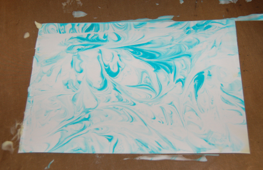
The painting on the front of the card is done mostly with distress inks. Tumbled Glass ink is sponged over some watercolour paper, then lines are drawn in the sea area using Broken China, Tumbled Glass, Stormy Sky and Weathered Wood Distress markers. A water brush is then used to blend the blue colours together and give a watery look. A line of Broken China ink is added and smudged on the horizon. The sailing boat and birds are painted with watercolour paints.

After the painting is dry, a circle is diecut into the picture. A matching circle is diecut into the front of the bookcard. The painting is stuck onto the front of the card with PVA, lining up the two circles and gluing a length of baker twine in between the layers to tie the card together once finished.


A circular frame is diecut from dark brown card and decorated with gilding wax before gluing around the aperture with glossy accents.


The octopus charm is glued over the top with Pinflair, and three little drops of glossy accents are used to stick the teardrop gems to the bottom right corner.

"Inside"

Another circle is diecut into wood patterned paper and a piece of acetate sandwiched between it and the front cover of the book card using PVA glue. This provides the "window" of the fish tank. Another frame is diecut from brown card and decorated with gilding wax before gluing in place around the aperture. Brass buttons are glued around the frame to look like a porthole.

"Fash Fram the Sea"

The background sea started out as two pieces of brown card embossed with twigs and decorated with different gilding waxes. A large circular aperture is cut into one piece and this is glued on top of the book "pages". The other piece is glued behind.

"Fash"

The individual fish are stamped with versamark on watercolour paper and heat-embossed in gold before colouring with distress markers and a water brush, and cutting out. After shaping, the fish are attached to small strips of acetate and glued into the book card so the fish appear to float in the water.

"Fronds"

The fronds are diecut from brown card, decorated with gilding waxes, and stuck into the book "pages" with glossy accents.

Finally, charms are glued inside the book card with glossy accents, and more are strung together with beads, chain and jump rings and attached to the side of the card via an eyelet to look like buried treasure rising up from the depths of the sea :-)

I hope you find some buried treasure this week, and have a go at our challenge. Can't wait to see what you come up with! Maddy x

Ingredients:
Kars fish stamps
Versamark ink
Stampendous embossing powder, pirate gold
Spellbinders foliage
M-Bossabilities Tweets and Twigs
Sizzix framelits: circles
Creative Expressions Gilding Waxes: patina, enchanted gold
cardstock: brown 300gsm, white 220gsm, watercolour paper, wood pattern
acetate
distress ink pads: Tumbled Glass, Broken China
distress markers: Tumbled Glass, Broken China, Weathered Wood, Pine Needles, Spun Sugar, Dusty Concord
watercolour paints: black, white, brown
adhesives: Glossy Accents, Pinflair, PVA
brass charms, jump rings, beads, chain
brass eyelet
brass buttons
teardrop gems
bakers' twine

Wednesday 3 July 2013

Window Box Tutorial and a Card for Sue

My friend Sue, aka Bearhouse, was the first person I ever swapped a card with and we've been swapping birthday and Christmas cards ever since. She's been a good friend to me and I wanted to make her a special card this year. I know she liked it and I thought I'd share it with you. The brick background uses the technique I detailed yesterday in my "Tuesday Technique" post.
 
"Sue's Birthday Card"

I came up with this idea for a window box to fit the Chateau Gate windows and thought you might like to see it. You can easily resize the window box to fit any window by cutting the piece of card wider at the start.


1. Start with a piece of strong (300gsm) card 10.2cm (4") x 8cm (3 1/8").


2. Use a scoreboard to score lines at 0.5cm and 2cm from each side.


3. Score lines at 1.5cm and 3cm from the bottom edge.


4. Use the score lines as a guide to cut out two tabs (see photo).


5. Use a labels die to make a decorative top edge (I use Spellbinders Labels 1 or decorative labels 1 but you can use whatever you have). Because we are using thick card, it may need a couple of passes through the machine.


6. You can make the box any height by cutting at a different place, but it should be at least 1.5cm from the horizontal score line since the rest of the box will be 1.5cm deep.


7. Fold and go over all the crease lines with a scoring tool.


8. Fold up and glue the two little tabs to the back of the front panel.


9. Cut a piece of florist's foam 1.5cm x 1cm x 6cm and fit into the box. I found a big block of this stuff on sale at Dunelm Mill for 79p.


10. It's all ready to insert your flowers. :-)

"Flowers"
 
11. Just push the flowers into the foam in the window box once you've finished the rest of your card.
 
Entered for the following challenges:
Simon Says Stamp and Show - Anything Goes
Bearly Mine Challenges - Anything Goes
Inky Chicks - Anything Goes
Loves Rubberstamps - Anything Goes
A Little Bit Crafty - Die-ing for it
Papertake Weekly - Anything Goes

Tuesday 2 July 2013

Tuesday Technique - Inking With Embossing Folders - Brick Background

Lee suggested that you might like to see tutorials on some of the inking techniques I use, so I thought I'd start by showing you this ink and emboss technique that I use a lot with embossing folders. It's especially useful when you want a different colour in the recesses of the embossing to the colours on the raised parts.

"Recesses"


1. Start by deciding which side of the embossing folder to ink. You want the ink to end up in the recesses, so it's normally the top side (often labelled). Swipe your ink pad all over this side and carefully place a sheet of white card into the sandwich, closing the folder onto the card rather than sliding the card in so as not to smear the ink. Make up your sandwich and pass through a roller-type machine.

I've used Pumice Stone distress ink to look like grouting in between the bricks. You can use any type of water-based ink, but the ones that take a while to dry work the best. Don't forget to give your folder a good wash straight after using.

"Splodges"

2. When you look at old brickwork, you'll notice that the bricks are not all the same colour and there can be quite a lot of variation in the brickwork. Using more colours makes it seem more realistic to me, so I start by giving a background inking of three different browns. Here I've used antique linen, vintage photo and brushed corduroy. I apply the inks with small pieces of cut 'n' dry rather than using applicators. Don't know why, I just get better results that way!

"Uniform layer"

3. Next, cover the whole sheet with a layer of Fired Brick. You can see the different browns underneath giving that wonderful splodgy look.

"Lowlights"

4. A light swipe of Aged Mahogany brings out a little more detail from the embossing.

"Frame"

5. Adding Walnut Stain around the edges provides a frame.

Use the finished piece like this, or cut it down if you want it smaller. If cutting, add more Walnut Stain ink to the cut edges. I hope you'll join me later in the week to see a project using this background.

Taking it further...


6. Once you've finished the brick background, you can take the process further by embossing a different pattern over the bricks. Here I've embossed twigs over the bricks and coloured them by lightly swiping with Pine Needles ink to provide a contrast. The finished effect reminds me of Sleeping Beauty's castle where the plants grow all around while everyone in the castle sleeps for a hundred years...


7. Here's the same piece after being swiped with versamark and heat-embossed with glittery embossing powder giving even more contrast.