Friday, 30 September 2011

Autumn

The background image for this card is another free one from the Graphics Fairy; the edges are covered with skeleton leaves to add to the autumnal feel.
"A card for Autumn with leaves and squirrels"

The leaves on the border are from a stamp that came free with "Craft Stamper" magazine.

"Embossed leaves"

The embossing uses a "verdigris" embossing powder which is a mixture of green and copper. I love the effect it gives.
  
"Squirrel"

Look closely and you'll see the squirrels' tails are feathers from our Road Island Red hens. 


Thursday, 29 September 2011

Seashells Shaker Card

I promised to put a shaker card on my blog this week, so here it is! Frame cards are easily turned into shaker cards. Just be sure there are no gaps in the foam tape holding the frame to the bottom image, and use a layer of acetate to retain the shaking elements.

"Sea Shells Shaker Card"

This frame is from the Graphics Fairy, the image from Crafty Individuals and the stamp was a free gift with Craft Stamper magazine. The shaker card is filled with tiny turqouise & white seed beads.

Tuesday, 27 September 2011

The Mad Hatter


When I was eight, we had a fancy hat competition at school. My mother insisted on sending me in a top hat with a 10/6 price tag and I won third prize. OK, I've said it before, I was a weird kid - it was fairly appropriate to turn me into the Mad Hatter, especially when you consider my name is Maddy! I've been a fan of Alice in Wonderland ever since.

"The Mad Hatter"

This original vintage Mad Hatter image is from the Graphics Fairy.  The background stamping uses a Hero Arts stamp with distress inks, and the other bits and pieces are from Papermania's Persimmon collection.


"Mad Hatter 'Fridge Magnet"

The image is unaltered except for the addition of a little colour with promarkers. The frame was enamelled by triple embossing. A piece of magnetic sheet was fixed behind the frame, and some steel card stuck to the card to attach the fridge magnet to the front.

Monday, 26 September 2011

Einstein

My Dad once caught me reading illicitly in my bedroom. I was about 11 years old and the book was an explanation of General Relativity. Dad had been a singer in bands in the 1960s. He used to tease me that they had brought home the wrong child from the hospital and that somewhere out there was a pair of scientists with a teenage rocker drumming away in their bedroom and they would be saying "where did we go wrong?" I was a weird kid.

"What?"

This image is from a blog that Lee told me about called Magic Moonlight Studio Free Images. Definitely worth a visit if you like free vintage images (what's not to like - they're free!). The frame is from the Graphics Fairy. The background is one of my first plays with alcohol inks - just dripped onto silver mirri card.

Sunday, 25 September 2011

My first three ATCs

My work usually has lots of detail, but I wanted to take part in the Simon Says Stamp and Show Challenge which this week asks for an ATC, so I decided to make a set of three.

"Set of three ATCs"

The background papers are all from Tim Holtz' Lost and Found paper pad, which conveniently has some patterns in the right size for this format, the embellishments (including the dress form) are almost all from shrink-plastic, some inked and some embossed with gold embossing powder. Each ATC also features a Tim Holtz adage ticket with some additions.

"HOPE the rain stops!"

You don't normally see Tim Holtz' umbrella man with his umbrella down :).

"TRUST your time will come"

For all the struggling artists out there!

"LOVE life"

That's my philosophy anyway :) Whatever you do today, find five minutes to enjoy.

New house, new home

A couple of weeks ago, I couldn't resist buying some pop-up Bigz XL dies in the Sizzix sale. The house pop-up was sitting on my desk when this gorgeous old colonial house turned up on the Graphics Fairy's blog.

"New Home Card Front"

I printed a few copies off and made a decoupage, then used another fabulous Graphics Fairy image for a frame, and that was the front of the card.

"New Home Card Inside"

We lived in Cornwall for ten years, and I just had to turn the pop-up house into a Cornish cottage. I'm a little disappointed that the walls don't sit quite straight when the card is opened, but the overall effect is still quite good.

"New Home Card inside side wall"

Some printed card was used for the walls, and the "slate" roof is just a piece of black card with pencil lines to mark the edges of the slates.

"end of house showing door"

A second die-cut was made from white card and cut out to provide window & door frames. "Slate" windowsills were made from more black card.

"end of house showing shrubbery"

An edge punch was used to make the greenery growing up the chimney end of the house.

"Organza flower"

Finally, the garden was filled with handmade organza flowers with jewel brad centres, and "New Home" added using a Tim Holtz alphabet. Hope you like it :)

Thursday, 22 September 2011

Icarus and Brunel - it's steampunk time again!

Icarus and Brunel, a bit of a weird combination you might think, but not if its steampunk!

"Flying High"

For anyone who doesn't know, Icarus flew too close to the Sun. The heat melted the wax holding the feathers to his wings and he fell to Earth. OK, so "binocular man" isn't exactly Icarus, but you get the idea :) These feathers were kindly donated by our Road Island Red hens (hubby wants me to make it clear I collected them from the nest boxes after they were moulted and don't go around chasing the hens to pluck their feathers out!!).

"Baby Icarus"

I thought some baby "Icari" might be fun :) As usual, the free images are from the Graphics Fairy. They were sized, cut and layered. Any colouring was with promarkers to match the dress fabric.

"Adage ticket"

Just had to use an adage ticket, attached with a gold safety pin, in keeping with the Tim Holtz dress form & background paper.

What about Brunel??

"Railway"

Well, he isn't exactly Brunel, but I do think that the top hat man from this Creative Expressions stamp set makes a good Railway Engineer. The stamping and masking was done onto a page about Railways from an old Almanac.

"Gear embellishments"

These gear embellishments were made from shrink plastic, die-cut from Sizzix' Tim Holtz' Gadget Gears die, coloured with gold promarker, shrunk, then heat embossed with Cosmic Shimmer gold embossing powder. I purposefully left some areas without too much ink so the gears took on a more "used" appearance.

Entered for the Simon Says Stamp challenge

Monday, 19 September 2011

Alice in four dimensions

No, not Alice's restaurant but Alice in Wonderland! This card is dedicated to a good friend of mine, Lee at A Wee Bit of CraftyLoops. She sent me some gorgeous embellishments and kick-started the process which culminated in this creation:

"Alice card front"

"Alice card inside"

The general structure of the card is the same as for the concertina-type book cards in my "Tunnel Cards 2" blog. The sheets were all cut from embossed gold card, then apertures removed in descending order from front to back. Each layer was inserted and a myriad of die-cut gears & cogs used as embellishments to build up a giant 3-d clockwork structure.

"Inside of card showing die-cut gears"

Gears were cut using the Sizzix Tim Holtz' & Spellbinders' gears sets. I would have liked to use Tim Holtz' Weathered Clock die to embellish the front of the mechanism, but I don't have it! So instead, a variety of embossed clock fronts were used:


"stamped and embossed clockface"

Each clockface was stamped & embossed with gold powder before being cut out and positioned. The one shown above is from a Tim Holtz stamp set.

"White rabbit panel"

The two picture panels and the image in the centre of the cameo are all adapted from images on the Graphics Fairy's blog. The white rabbit is coloured with promarkers, and his fur made more realistic with the use of a white gel pen to give some texture. A little glitter glue highlights the watch and watch chain.


"Mad Hatter panel"

All three images were digitally manipulated to remove the backgrounds so that they would "pop" from the backgrounds, then printed onto cream card and coloured with promarkers.

"Alice cameo"

The image for the Alice cameo insert was printed very small and trimmed to fit before colouring and sticking in place. The hollow was then filled with glossy accents. This was my first attempt, and you can see a couple of tiny problems - the ink ran a little, and there are a couple of tiny air bubbles. But hey, it's handmade! :)

"Pocket watch embellishment"

The pocket watch was attached to the cameo with a small book ring, and the whole embellishment threaded through an eyelet set into the front of the card, so that it might be removed and used as a key ring.


"Complete hanging embellishment"

The blank cameo and pocket watch embellishments were the items that Lee sent that started this project. I love the whole idea of "what is the nature of time", and that if you think of time as Einstein did, as a dimension, then all those moments that we have lived must still exist somewhere. All of time is there, now, we are just travelling through one aspect of it, as if on an arrow. Is this a bit deep for a Monday? :)

"detail from inside panel showing lettering"

The lettering was die-cut twice in black and gold. The gold letters were positioned over the black letters to give the illusion of shadows and depth. Be careful what you do today, remember that all those little acts will exist forever :).

Entered for The Altered Alice challenge

Saturday, 17 September 2011

Anniversary cards - a Balloon, a Pop-up Heart, Two Swans and lots of Love!

I got a bit carried away on our last wedding aniversary. Couldn't decide which card I liked best and ended up giving my husband not one, but three cards! I just love the image on the front of this card, yet another free one from the Graphics Fairy.

"Anniversary card number 1 - front"

The flowers are from organza cut with Tim Holtz' Tattered Florals die and then singed around the edges with a heat tool before layering together with brads. You need to use the cheap organza, not the real silk fabric, or you don't get the right affect. I use a pokey tool or embossing tool to hold the fabric down onto a heatproof mat while I heat the edges. Work quickly and bring the heat in from the outside in, or you'll just end up with a lump of molten plastic! Probably best to keep the windows open too - you never know what nasty fumes you'll get from heating plastics.


"Anniversary card 1 - inside pop-up heart"

My husband must get bored saying how nice my latest card is, so I try to give him a "Wow" on the inside of the cards when I can. I was in a "love you so much it hurts" mood when I made this one :). The die cuts are Spellbinders "Fallen Angel" set.


"Anniversary card 2 - True Love"

Swans mate for life. I was lucky enough to meet my soul-mate and we have been married for over twenty years now. I just love this Kanban topper and the way the swans' necks form a heart.

"Anniversary Card 3 - Love"

The basic design for the third card was a blatant rip-off of a card featured in an article in "Craft Stamper" magazine, but whilst their card was carefully stamped & embossed, mine used up a sheet of red & gold heart-themed peel-offs, and I had some unusual embellishments for the tag inside the card:

"Anniversary card 3 - tag"

Yes, you see correctly - there's a tea caddy spoon attached to the key! I thought it was a nice variation on the "love spoon".

"Anniversary card 3 - inside"

The unusual part of this card is the integral box of chocolates with a heart-shaped aperture covered in acetate to stop the chocs falling out (as you can see, most of the choccies have been eaten :)).

Hope you all have a good weekend x

Friday, 16 September 2011

Kitchen Art - Artificial Additives

I used to love lemon squash, lime cordial and limeade when I was a kid, but they used to give me asthma every time I drank them. As an adult I discovered an allergy to artificial food colourings. The Tim Holtz paper from the "Lost and Found" paper pack covered in old-fashioned soda bottle tops reminded me of those days and inspired this piece.

"Artificial Additives"

The face is from a Graphics Fairy image and the lettering cut using Tim Holtz' "Upon a Time" die.

Thursday, 15 September 2011

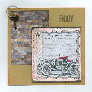
Car Card

Just a quick one today to celebrate our vehicle passing its MOT again - yeah!


It's old, but not as old as this one :)

Wednesday, 14 September 2011

Tunnel cards 2 - a Castle and lots of Flowers

Another method for making tunnel cards is the "concertina" method. This type of tunnel card is sometimes also know as a "book" card. A large aperture is cut into the back sheet of a standard folded card. Two sides are formed from identical pieces of card cut to the same height as the card, and each scored with a number of vertical lines about half an inch or 1.5cm apart. The side pieces are then folded back and forth to create two "concertina" pieces. The size and number of folds depends on how many layers you want to make. If you make the two side pieces about 15cm wide, and hence score 9 vertical lines, each 1.5cm apart, this allows for 4 layers. To make the layers, cut 4 pieces of card to the same size as the folded card. The back layer must remain intact, and the others have apertures cut into them. The top of the concertina is fixed to the back of the folded card. The layers are slotted between the concertina folds and glued at the edges with PVA.


Top of "book card" showing concertina folds

The front of the card is decorated as normal.


"Front cover of book card"

Each layer is decorated to make up a picture with lots of depth.


"Inside of book card "

The book card shown above has a number of layers with large oval apertures cut out, and a back page formed with a decoupaged castle. Each layer features various cut-outs of medieval princesses. Most of the free graphics are from the Graphics Fairy's blog.

This technique can be used to make cards of different shapes and sizes and with a number of different embellishments, and is a great way of using up stash. The layers can be made from patterned papers, and it's one of those designs that lends itself to the use of lots of embellishments!


"Flowers 1 front"


"Flowers 1 inside"

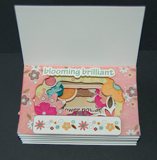
The apertures in the layers for this flowers card are different sizes. The apertures get smaller the deeper into the card you go. This gives the illusion of even more depth and leaves extra room for the embellishments.

"Flowers 1 top, showing concertina folds"

These flower cards are all made from the "Sugar and Spice" collection of papers & embellishments.


"Flowers 2 front cover"


"Flowers 2 inside - flower power!"

When I was given the pack I thought it was a bit "twee".


"Flowers 3 front cover"


"Flowers 3 inside - if friends were flowers, I'd pick you"

But I'm pleased how the cards turned out :)