Friday, 15 March 2013

Tim Holtz' 12 Tags of 2013... March

This is my take on Tim's March tag.

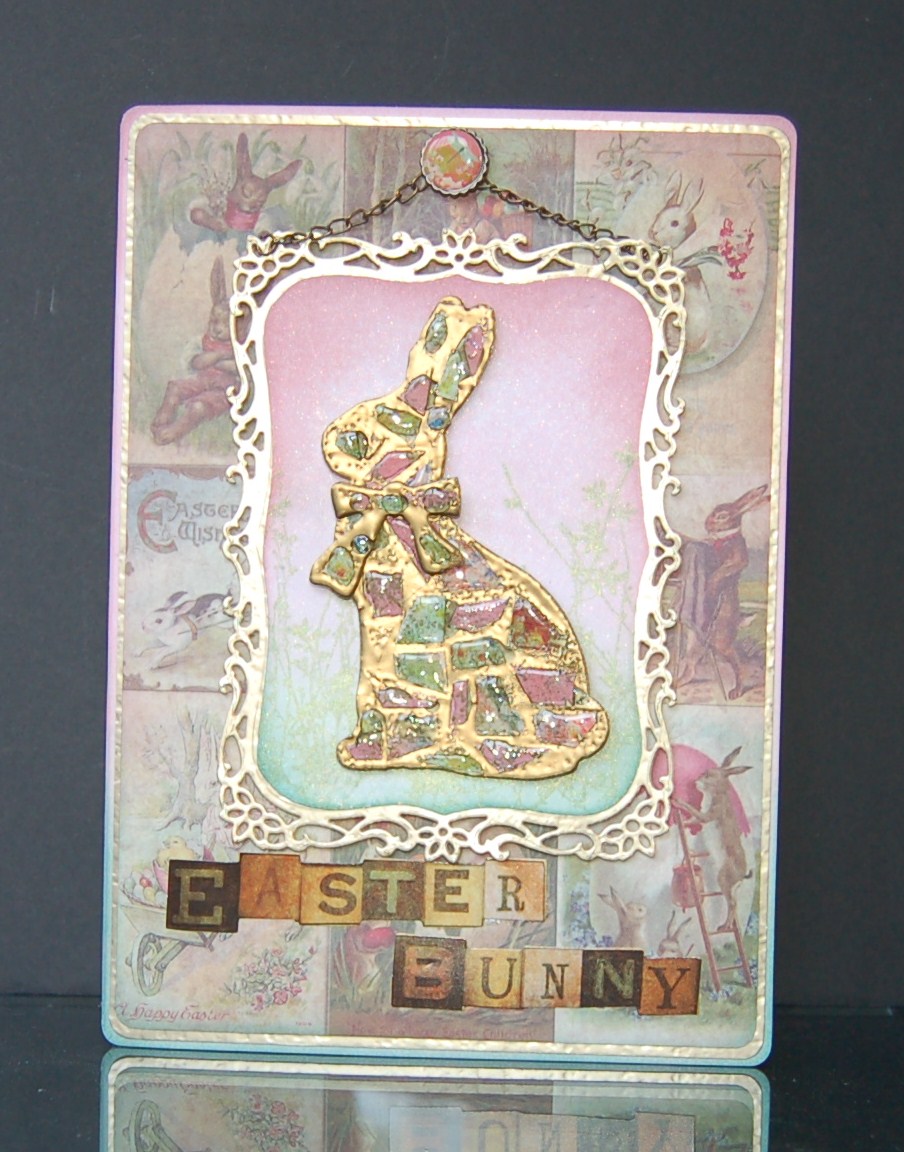
"Easter Bunny"


The larger Bunny Bigz die is used to cut the aperture, and the card is then passed through the Ornamental M&S die to shape the top and bottom edges before inking and stamping. Images from the Seasonal stash paper pad are fixed benhind the aperture and this piece mounted with foam for extra dimension. The background paper is cut to size and the edges inked, then various diecuts are inked to match and fixed to the bottom edge of the card. A couple of paper flowers are added to the right hand side, their stalks glued in with glossy accents.

"Easter Card"

I liked the first one, but wanted to make one with an Easter sentiment so moved things round a bit and made another! Have a good weekend, and happy St. Patrick's day on Sunday. xx

Ingredients:
Tim SizzixHoltz Bigz Bunny & Ornamental M&S
Tim Holtz paper stash: Seasonal, Lost and Found
Tim Holtz distress inks: Spun Sugar, Tumbled Glass, Broken China, Bundled Sage, Peeled Paint, Chipped Sapphire
Tim Holtz Stampers Anonymous Spring Sprung
Spellbinders Die D-Lites: Cattails, Flower Burst, Poppy Patch, Fancy Tags

Entered for the Tim Holtz gallery

Thursday, 14 March 2013

Pop Butterflies

The Justrite challenge this fortnight is to make it pop. With Spring in the air, I couldn't resist the butterflies!

"Pop Butterflies"

The large butterfly is diecut from A5 card. A second piece of card is coloured and stamped and placed beneath the aperture. The two pieces of card are adhered with foam tape, and the diecut butterfly is coloured, stamped and replaced in the aperture, lifting the wings for extra dimension. A couple of stick pins are constructed with beads and glued into place to make antennae.

"Side view showing dimension"

The top butterfly is stamped onto the card and again on scrap card, cutting out the second butterfly, colouring and adhering the centre part only, lining up with the original stamped image. The wings are again lifted for added dimension. Small gems are added to the antennae and along the spine of the butterfly.

"Justrite sentiment and frame"

The sentiment and frame are stamped in black archival and heat-embossed with clear, holographic powder before cutting out with the matching die and adhering to the card with foam pads. The flowers are diecut and just the bottom edges layered onto the card with foam pads so the tops are free, can be shaped and look more realistic.

Ingredients:
Justrite stamp set: Grand Sentiments
Technique Tuesday stamp set: Get in Gear
Spellbinders: Resplendent Rectangles
Spellbinders Die D-Lites: Flower Burst
Distress Inks: Peacock Feathers, Shaded Lilac, Squeezed Lemonade
Archival Ink: Jet Black
Embossing powder: Stampendous Kaleidoscope Clear
stickpins, beads
gems
adhesives: foam pads & tape, glossy accents

Entered for the following challenge:
Justrite Friday Challenge 92 - Make it Pop

Wednesday, 13 March 2013

It's a Love Thang

This week, Simon Says Stamp and Show... Chic to be Shabby. This wall hanging is a bit more shabby and a bit less chic, but I enjoyed making it and thought I'd take the opportunity to share it with you.

"It's a love thang"

The IndigoBlu stamp is stamped five times onto white card using different colours of archival ink each time and heat-embossing with clear, holographic powder. The four panels are then coloured by sponging with distress inks and diecut with different dies, most of them nature-themed.

The frame was originally part of a pack to make windows for dollshouses that I picked up in a charity shop. I sponged it with distress inks and added gold embossing powder to make it look as if the gold had rubbed off in places. I just use up odds and ends of embossing powder for this sort of job, it doesn't need to be pristine.

"Side view showing dimension"

The diecuts are carefully layered to preserve the design so that all the words can be read, and glued with Pinflair for lots of dimension. Finally, the whole thing is lightly sprayed with Tattered Angels Glimmer Mist to tie the layers together.

Ingredients:
IndigoBlu stamp: TrulyMadlyDeeply
Archival inks: Jet Black, Cobalt, Crimson, Coffee
Distress ink pads: Tattered Rose, Tumbled Glass, Bundled Sage, Antique Linen, Plum
Tattered Angels Glimmer Mist: Coffee Shop
Spellbinders: Labels Four, Mix'd Media Elements, Foliage, Fanciful Flight
frame
embossing powders: Stampendous Kaleidoscope Transparent, gold
cardstock: white 200g

Entered for the following challenge:
Simon Says Stamp and Show...Chic to be Shabby

Saturday, 9 March 2013

Happy Mother's Day

First of all, I want to thank those lovely people at the Simon Says Stamp and Show for picking my "His 'n' Hers" cards for the top three this week. I'm thrilled! Since you all seemed to like the design so much, I thought I'd share a similar one that I made for my Mum for Mother's Day tomorrow. For any confused American readers, here in the UK we have Mother's Day on a different day of the year to you :-)

"Happy Mother's Day"

I used a soft, pastel colour palette which seems apt for a Spring card, and followed the usual construction method in my tutorial. For these landscape cards, the cover is often made from two pieces of card glued together along the spine with PVA. This is simply because I tend to work with A4 card (approx 9" x 11") which isn't quite big enough to cut in one piece.

"Left inside panel"

The background scene for both the inside panels is stamped repeatedly using olive archival ink and coloured with distress inks and a water brush. The bottom part of the left hand panel is finished with sponged distress ink and overstamped with grasses using the same colour (Bundled Sage). The sentiment was from a pack that came free with a magazine, just cut out, the corners rounded and raised on some foam pads. I wanted to keep the sentiment simple since the background is so ornate; it draws the eye better.

"Dimensional panel"

The diecuts are cut from thick white card and sponged with distress inks. The flowers are lightly embossed with clear holographic powder before gluing in place with glossy accents (it's a great glue for this since it sticks virtually straight away and the thin nozzle makes it easy to get it in the right place). The embossing gives all the flowers the sparkle look of morning dew, but it doesn't really show up in the photo unfortunately. Both panels are edged with lace sponged with distress stain to match the project. The lace flowers are cut from a wider strip of lace, the leftover strips are used to make the closure, gluing inbetween the panels and the covers.

"Front cover"

For the front cover, I watercoloured a brick background using distress inks, edged with a diecut, and added a stamped and diecut window, also coloured with distress inks. A glimpse of a third version of the inside background stamping can be seen through the window to give a taste of what's inside.

Ingredients:
Heartfelt Creations Chateau Gate die and matching stamp sets HCPC 3447 Window Accents & HCPC 3445 Mystic Hideaway
IndigoBlu stamp set: Nature 1
Spellbinders Decorative Labels Eight
Spellbinders Die D-Lites: Fantastic Flourish One, Poppy Patch, Flower Burst, Cattails
cardstock: white 220gsm, red 300gsm
distress inks (pads, markers, stains, reinkers): Tumbled Glass, Bundled Sage, Tattered Rose, Spun Sugar, Milled Lavender, Antique Linen
archival ink pads: Olive, Coffee
lace
sentiment
adhesives: PVA, Glossy Accents, foam tape

Entered for the following challenge:
Country View Challenges - Pick 'n' Mix

Wednesday, 6 March 2013

Mellow Yellow Birthday

Another day, another birthday! This one is for a lady that I visit in a home and she is 87 this week. Wouldn't it be amazing to have lived that long; imagine how much the world has changed since she grew up a farmer's daughter with sacking cloth aprons and buckets to milk the cows.

"Mellow Yellow"


The smaller layers are diecut and the edges inked with distress ink. The outer layers are cut rectangular and the corners rounded with a punch. Layers are cut from white card or patterned yellow card. I used a scrap of glittered daisy cardstock that has been in my stash for ages and you can just make out the flowers peeping out around the edge (click on the photo to enlarge it if you want a closer look). The inner layers are mounted using foam tape for extra dimension and a few gems add a touch of sparkle to the finished card.

"Sentiment"

The Justrite sentiment is stamped in black archival and heat-embossed in clear. The frame is stamped in versamark and heat-embossed in white, then diecut with the matching die, coloured lightly with distress ink (the embossing resists the ink) and also dry embossed using the smaller frame die for extra dimension.

"Bow, stickpins & UTEE embellishment"

The stickpins are made using some gorgeous beads given to me by my good friend Lee aka craftyloops, queen of bookbinding (I kid you not, have you checked out her amazing videos?). You might recognise the UTEE embellishment from the batch I made a couple of weeks ago using my own handmade moulds. A light dusting of perfect pearls on the warm UTEE gives a pretty, pearlescent finish.

Entered for the following challenge:
Justrite Friday Challenge 091 - Colour Challenge

Tuesday, 26 February 2013

His 'n' Hers

In the space of a few short weeks here in Northern Ireland, almost everyone I know has a birthday! My husband, his sister, her husband, my best friend and most of her family... the list is endless. I said to hubby that there must be something in the air in May and he said it was the only time of year that it's warm enough to take off your clothes lol! Anyway, since his sister and her husband's birthdays are only a couple of days apart, I thought it would be fun to make "his 'n' hers" cards for them...

"His 'n' Hers"

I guess you could use a similar idea if you had to make cards for twins.
NB click on the pictures to enlarge them if you want to see more detail

"His"

The cards are similar in style, but for the man's card I've used a much more masculine colour scheme of black and gold.

"Meadow"

I still wanted it bright though, so I cut the diecuts from holographic card to reflect the light well. It doesn't matter what the pattern is on the holographic card when you are using it like this, any sort of pattern will pick up the light and reflect it in different directions to achieve the effect. It's supposed to look completely random like a real late Summer meadow, with everything in full bloom.

"Daisy Chains"

You might recognise the sentiment from the "Daisy Chain" card I shared a couple of weeks ago. It's heat-embossed in gold onto black cardstock, diecut and matted and layered onto alternating black and gold diecuts, with some gold diecut flourishes for extra embellishments.

"Hers"

The woman's card has a much more subtle colour scheme, but I kept the bright gold diecuts to match the two cards and because I like the brightness in these dark, Winter days.

"Meadow"

The background is sponged & stamped with distress inks, and I've used lace for a more feminine border in place of the diecut in the man's card.

"Sentiment"

The sentiment is stamped and heat-embossed in gold onto white card, diecut and sponged with matching distress inks, then mounted with foam tape onto another inked and stamped background. More lace is added to trim, along with a few daisies peeking out from behind the sentiment panel.

"Covers"

Here they are closed and tied, ready to hand over. If you fancy having a go at a book card, I have a tutorial here. It's easier than you think :-)

Ingredients:
IndigoBlu stamp set: Enjoy Life
Spellbinders dies: Labels 20, Resplendent rectangles
Spellbinders die d-lites: Poppy Patch, Cattails, Flower Burst, Fantastic Flourish One
Distress Inks: Tumbled Glass, Bundled Sage, Antique Linen, Tattered Rose
Versamark ink pad
Stampendous embossing powder, pirate gold
cardstock: brown 300gsm, black 300gsm, white 160gsm, black 160gsm, gold holographic
ribbon, gold (for ties)
lace
Daisies
adhesives: PVA, Pinflair, foam tape

Entered for the following challenge:
Simon Says Stamp and Show - The Stamp You Love (but don't use). I just love that IndigoBlu "daisy chain" stamp from the "Enjoy Life" set and thought I'd have a go at using it on a birthday card. It reads "Take the time to walk barefoot in the grass making daisy chains & believe in the beauty of your dreams".
Timeless Tuesday - All That Glitters


Tuesday, 19 February 2013

Metal Mosaic Tutorial and an Easter Bunny Card

This week, Simon Says Stamp and Show...Metal-ology. I thought it would be a good chance to share a technique for making a metal mosaic which I used to make an Easter bunny for this card:

"Easter Bunny Card"

I like to recycle bits of old packaging in my cards, so often use cat food & dishwasher tablet boxes when I want a bit of thick card. Strong dishwasher or washing tablet boxes are ideal for use with this technique.

"Cover Card with strong ds tape"

1. Start by cutting a piece of strong card to roughly just over 5 x 5 inches.
2. Cover with strips of strong double-sided tape. I just use the cheap, red tape that you can buy in bulk at the craft fairs. If you want to be posh, you could use sticky sheets instead.

"Die-cut Covered Card"

3. Run your card through a die-cutting machine with a steel rule die such as a Sizzix Bigz die and separate the pieces.

"Remove tape backing"

4. Carefully remove the backing from the tape, taking care not to lift the tape from the card. If you accidentally lift the tape in a small section (like I did here with the bunny's ears), you can add a bit more and cut around it with a pair of scissors before having another go.
5. Cut up small scraps of patterned card to make the mosaic tiles.

"Arrange Mosaic Tiles"

6. Arrange the pieces of mosaic, pressing them down into the sticky tape and leaving gaps in between each of the edges.

"Heat-emboss"

7. Place the prepared die-cut onto a piece of paper and sprinkle metallic embossing powder onto all the exposed areas of sticky tape.
8. Shake off excess embossing powder and return to the pot.
9. Working in a well-ventilated area, heat the embossing powder and enjoy the little miracle (I never get over this, just love watching the powder transform!).

"Second Coat"

10. Re-heat each small area in turn, quickly adding a second coat of embossing powder while the first coat is molten, then heating again to melt. In this way, you can make a thicker layer of embossing that looks more metallic. If any bits are missed, you can also use an embossing pen to stick extra powder exactly where you want it.

"Glossy Accents"

11. Repeat all the steps to cover the matching bow.
12. Add a blob of glossy accents to each of the paper tiles and allow to dry overnight.

"Finito"

13. And this is Mr. Rabbit after drying. The extra coats of metallic distress powder give the edges of the paper a round appearance and the glossy accents makes the paper look like pebbles set in gold.

"Hanging Frame"

I made a quick background for the bunny with some sponged distress inks and stamping with green Perfect Pearls brushed on, then cutting to fit a frame die-cut from hammered gold cardstock. A couple of lengths of chain were fixed to the top of the frame with jump rings and attached to the card with a decorative brad. The frame and bunny were mounted with foam tape for extra dimension. The bottom layer of patterned paper was inked around the edges and matted onto more hammered gold cardstock, and finally fixed to a blank whose edges were also distressed. A Salvage Sticker sentiment was stuck at the bottom.

Ingredients for metal mosaic:
empty dishwasher tablet box
strong double-sided tape (or sheet)
steel rule die (I used Sizzix Bigz Tim Holtz' Bunny & Butterfly)
scraps of patterned paper (I used Tim Holtz Lost and Found)
metallic embossing powder (I used some old dregs of Cosmic Shimmer, it doesn't have to be pristine because any mottles and bits just make the whole thing look more realistic)
glossy accents

Ingredients for card:
metal mosaic
cardstock; white 300gsm (for card base), white 160 gsm (for inking and stamping), hammered gold 200gsm
Tim Holtz Seasonal paper stash
Tim Holtz Seasonal Salvage Stickers
Stampers Anonymous Tim Holtz stamp set: Spring Sprung
Spellbinders Decorative Labels Eight
Distress Inks: Bundled Sage, Pine Needles, Spun Sugar, Victorian Velvet
Perfect Pearls, heirloom green
chain, jump rings and decorative brad
adhesives: foam tape, PVA

Entered for the following challenge:
Simon Says Stamp and Show - Metal-ology
Cutie Pie Challenge - Pretty Pastels
Stamp and Create - Spring is Coming
Forever Friends - Animals and/or Butterflies and/or Birds