Project One "The Circus"
When I was a little girl, we didn't have a lot of money and didn't go out that often, but when we did go, my Dad liked to do it in style. Once, he took us to the circus, and bought front row seats. My younger sister was terrified of the clowns and we ended up having to move back a few rows. I was mesmerised by the colours, the smells, the noise and just the sheer fantasy of it all, and this Graphic45 collection brought it all back to me.

"Plain front with porthole"
This old advertising print makes a great, plain front with a hint of what's to come from the porthole set into the front. This was made like a frame card, where an aperture is cut into the patterned paper then covered from behind with acetate. A picture is glued onto the card front behind the acetate, and the acetate frame lifted from the picture with foam tape. The picture has been cut from a sheet of tags and the tag had a lovely curvature which really lent itself to the porthole idea.

"The circus - a dimensional scene"
The inside of this card reveals a riot of colour and images cut from the Le Cirque papers. The dimensional construction looks spectacular, but is fairly easy to achieve.

"Card with apertures"
Take 1 x A5 and 3 x A6 pieces of red card, and cut concentric apertures into each as shown, with the largest aperture on the right hand side of the A5 piece. Fold the A5 piece in half to make the card front.
[NB: for US readers, A4 is 11.7" x 8.3", A5 is 8.3" x 5.8", A6 is 5.8" x 4.1"]

"Folds"
Take an A4 piece of red card and cut lengthwise to make a piece of card 11.7" x 5.8" (that is, the length of an A4 sheet and the height of an A6 sheet). You want a flat area in the middle that is the same width as the A6 cards (4.1"), with folds at 1/2" intervals on either side. To achieve this, score the first fold at 0.3" from an edge, then make 6 more creases each 1/2" apart and do the same from the other side.

"Concertina folds"
After scoring all the creases, fold each side in concertina fashion.

"Concertina folds top view before gluing"
Next comes lots of gluing. I like to use glossy accents for dimensional gluing because it bonds really quickly.

"First panel glued in place "
The card with the smallest aperture is glued in place on top of the first folds.

"Cut patterned paper to A6"
For this design and to save paper, I cut a plain oval from patterned paper slightly larger than the smallest scalloped oval aperture.

"First patterned papers glued in place"
The oval is glued onto the back panel beneath the aperture. The other part of the paper is glued on top of the first card with aperture. I just use PVA for gluing papers - it's cheap and sticks well.

"All panels with apertures & patterned papers in place"
Continue gluing pieces of card with apertures of increasing size, adding patterned papers as you go, until the card front is glued on the top.

"Top view showing construction"
At each layer, just glue to the right and left hand folded edges as shown above. In this way, the card will actually fold flat if required, but will also spring up to make a tunnel.
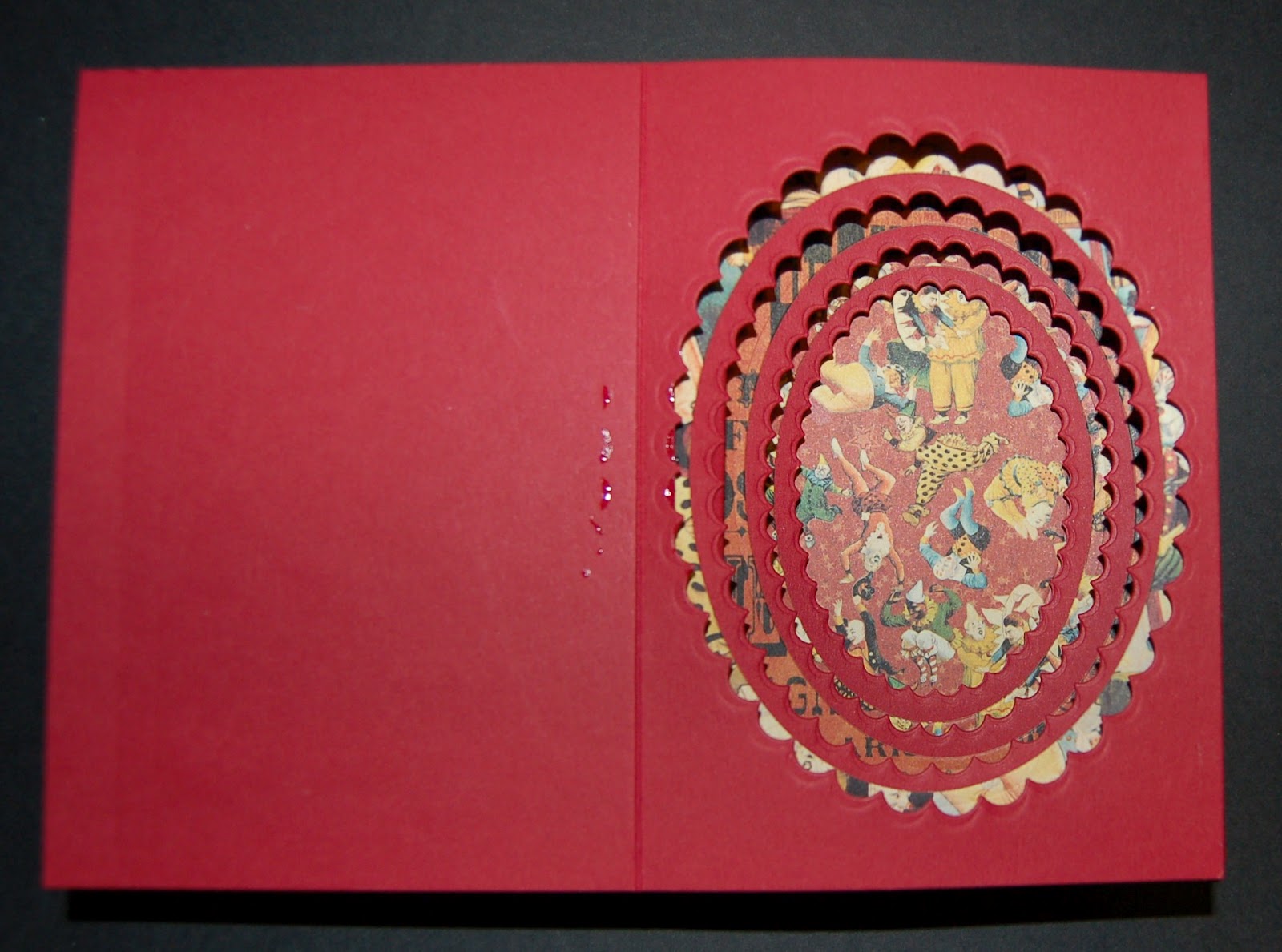
"Blank slate"
This is the construction part finished, all ready to add the detail.

"Clown"
I just love this clown striding out from behind the curtain. Like most of the other characters, he was cut from Le Cirque paper, shaped by hand, and glued with Pinflair dimensional glue.

"Circus characters"
The rim of each aperture is covered in circus characters, each one protruding out into the tunnel. The smallest are at the bottom and the largest near the top, adding to the illusion of depth.

"More characters"
Each of the characters is stuck with dimensional glue. I find this glue very forgiving. It has some flexibility once set, so that images do not become unstuck when the card flexes.

"The audience"
I really like the audience characters, peering out from the final tier at the bottom of the card, in awe or petrified! The lion is fighting someone off the edge of the page - you can just see the lion tamer's chair poking in from the side.

"Plain Box"
The box for this card is very plain, just like the outside of a circus tent. I want the recipient to have a great surprise when entering! The box is made from the same red cardstock used to make the card and wrapped with a large red bow of satin ribbon.
Ingredients:
Graphic45 Le Cirque 8" x 8" paper pad
Graphic45 Le Cirque 12" x 12" tags
Spellbinders Nestabilities: Ovals, Scalloped Ovals
Sizzix Framelits: Circles
Cardstock: red, 300gsm, A4 x 5 sheets
Adhesives: Pinflair dimensional glue, Glossy Accents, PVA craft glue, foam tape
Distress ink: Barn Door
Acetate
Ribbon: deep red, satin
Project Two "Birdhouses"
The new Graphic45 Tropical Travelogue collection is just perfect to make these little birdhouses.

"Birdhouses"
The basic construction method is the same as in my tutorial from last September here.

"Card used for body of birdhouse"
The card for the body of each birdhouse is decorated using Graphic45's Tropical Travelogue stamps with a clear embossing and distress ink resist technique, then splatterd with water droplets before cutting. The lace is decorated with distress inks to match the card. A few birds and animals are cut from Tropical Travelogue papers to decorate the outside of the birdhouses.

"Birdhouses hanging from a light fitting"
I like to hang my finished birdhouses in the bedrooms. Graphic 45's double-sided papers are ideal for constructing the rooves, the edges of which can be seen from underneath when the birdhouses are hung.
Ingredients:
Graphic 45 Tropical Travelogue 8" x 8" paper pad
Graphic 45 clear stamps: Tropical Travelogue cling 3
Versamark clear ink, clear embossing powder and heat tool
Birdhouse plan
Cardstock: white, 160gsm
Distress Inks: Tumbled Glass, Antique Linen, Brushed Corduroy
Lace, coloured with distress inks above
Glossy Accents
Pinflair dimensional glue
Project Three - "The Fish Tank"
Regular readers of my blog will know that I love making dimensional cards. This is another type of tunnel card that I call the "acetate tunnel card".

"The Fish Tank - an acetate tunnel card"
I love the depth this type of construction can give to a project, and the acetate tunnel card is great for shadows too (can you see the shadows of the fish against the back panel?).
Cut a plain piece of card to 7" x 5". Score folds 1" in from each of the shorter edges. Cut a piece of patterned paper 5" x 5" and stick to the centre using PVA.
Cut a piece of Graphic45 patterned paper 7" x 5". Score folds 1" in from each of the shorter edges. Cut a large aperture in the centre 5" x 5" area, as large as you can without cutting into the sides.
Take a piece of fairly thick acetate, cut to 6" x 5" and score folds 1/2" in from each of the shorter edges.

"The 3 pieces required for the acetate tunnel card shown after cutting"
This is the best time to decorate the back panel, before it is covered by the acetate. For this card, the fish paper was covered with a layer of distress stickles, just using a finger to spread it out before leaving to dry (you can use a heat tool to dry distress stickles, but take care not to warp the paper). "Fronds" were punched from the Rainforest Tropical Travelogue paper. Some were stuck to the background panel using PVA, and others were adhered using Pinflair to raise them from the background and create a little depth.

"Top view of the 3 pieces"
The folds on each of the three pieces are bent as shown.

"Gluing"
The edges of the acetate piece are glued inside the back panel as shown above. Finally, the edges of the front panel are glued outside the edges of the back panel, and the card is ready for decorating. I use glossy accents to glue the edges for a strong, quick bond.
You can make this card in any size, just adjust the dimensions making the acetate panel 1" narrower than the other two pieces to allow for the smaller outside edges.

"Fish swimming amongst the fronds"
More fronds were cut and adhered to the acetate to give even more depth to the scene. Fish and other images were cut from the Tropical Travelogue papers and adhered as shown. Some of the fish were interweaved with the fronds, and others are free-floating on the acetate.

"Mermaid's fringed hair"
A couple of borders were cut and added to the top and bottom of the tank. The mermaid's hair was fringed by close-cutting into the image with a large pair of scissors, making parallel cuts and bending into shape with fingers.

"Charms and beads"
Charms and beads were added to a length of chain to simulate boat fenders, flotsam and jetsam that you often see hanging from the fences around boatyards.

"The sign"
I love the way the fish seem to be following the sign and heading for the beach, or this could be a sign for the recipient of the card saying "Hey, this way for the beach dude!" The palm fronds are tattered at the edges and shaped to look as if they are swaying in the breeze.

"Box"
A box was made from plain blue card, sized to house the fish tank card, allowing a little extra room at the sides for the charms. The box was decorated with papers, distress ink and plenty of lace.
Ingredients:
Graphic 45 Tropical Travelogue 8" x 8" Paper Pad
Spellbinders Nestabilities Labels One
Martha Stewart Deep Edger Punch, Leaves and Branch
Distress Stickles: Rock Candy
Cardstock: blue, 300gsm
Acetate, thick
Adhesives: Glossy Accents, PVA, Pinflair dimensional glue
Charms, Beads, Head Pins, Jump Rings, Chain
Distress Ink: Walnut Stain
Lace
Project Four - Curtain Call Candles
Decorated candles make great presents and they are much easier to achieve than you'd think. You don't need any expensive equipment except a heat tool, which many crafters will already have. You can use cheap candles, and any tissue paper (I am currently using a supply that came as wrapping on bookshelves). You can either print onto tissue paper using a computer image, or decorate the paper yourself with, for example, stamps and ink. As soon as I saw this Graphic45 stamp set, I thought it would be great for candles.
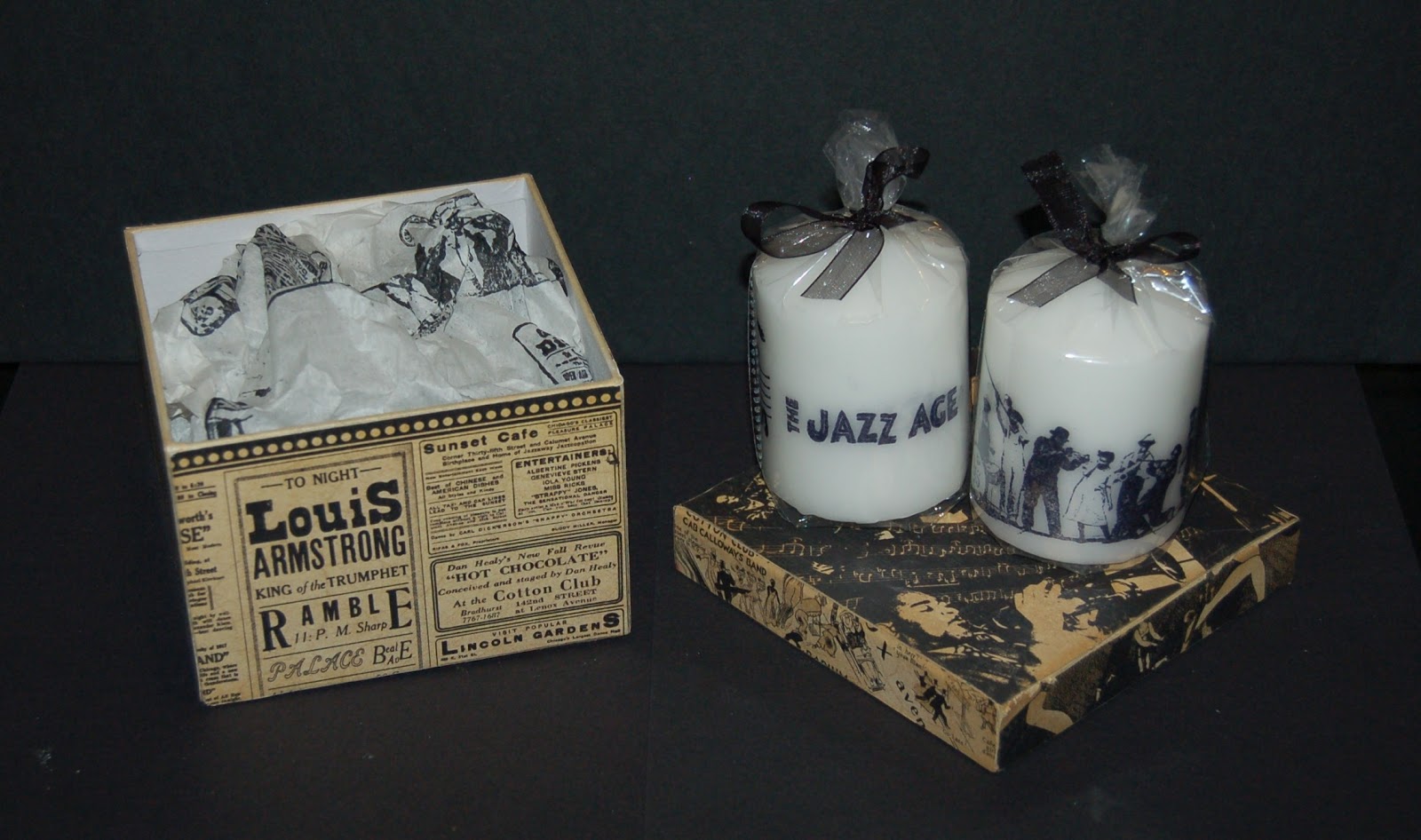
"Curtain Call Candles"
The circumference and height of a candle is measured, and used to cut tissue paper to size. The tissue paper needs to be just slightly smaller than the circumference so that it doesn't overlap when wrapped around the candle.

"Plain candle and tissue paper"
Most tissue paper has a shiny side and a matt side. Place the tissue shiny side down and stamp on the matt surface. I stamped the Curtain Call stamps using black archival ink. This jazz band was perfect for the candle I used, it was stamped twice and a neat cut made around one of the characters so there would be no obvious join when wrapped around the candle.

"Tissue paper wrapped around candle"
The decorated tissue is wrapped around the candle, leaving no air pockets or creases.

"Greaseproof paper"
Next, a layer of greaseproof paper is wrapped tightly around the candle and held in place with sticky tape. The top and bottom are scrunched (like the ends of a cracker) to keep the paper tight on the candle. You don't want any are bubbles or creases. You can sticky tape the bottom of the greaseproof to keep it from moving.
Heat the heat gun before you start heating the candle, then holding the paper at the top of the candle in your left hand and starting at the tissue paper join, carefully waft the heat gun up and down, from top to bottom, and move the candle round slowly as you work. The wax starts to melt, and the image becomes darker as you go. As soon as you see the image darken, move on. You don't want to hold the heat gun too long in any one place or you will get dimples in the wax. I find that it helps to rest the bottom edge of the candle on a heatproof mat and roll slightly as you work, but try not to rest any melted areas or you can get ridges.

"Appearance immediately after heating"
Once all the image has been heated, stand the candle upright for a couple of minutes to solidify the wax, then carefully remove all the packaging.

"Appearance after buffing"
Use a soft cloth to rub all the loose bits of wax from the top and bottom edges of the candle, and buff the image gently until it becomes shiny.
For the ultimate professional look, place in a cello bag and tie the top with some satin ribbon to match the image.

"Candles and a matching box"
The other stamps in the set were used to decorate a second candle, and a 12x12" sheet of Curtain Call paper used to cover a gift box. A large sheet of tissue paper was decorated with the same stamps. What a great present for a blues fan!
Ingredients:
Candle, plain, white
Tissue paper, plain, light-coloured
Greaseproof paper
Graphic45 cling stamp set: Curtain Call 3
Ranger Archival ink: black
Distress ink: Antique Linen
Graphic45 12x12" paper: All That Jazz
Project Five - Altered Dressing Table Set
I made a few of these as Christmas presents this year and they all went down well. The alarm clocks are fun to alter and make unusual novelties for the younger generation, who are so used to their digital readouts!

"Altered dressing table set"
I've nearly finished my favourite "Steampunk Debutante" paper pad, and altered these items using just a couple of sheets and some images cut from leftovers.

"Altered picture frame"
A plain wooden picture frame was sanded and the edges coloured with distress ink. The frame was covered with panels cut from the Graphic 45 Steampunk Debutante paper pad, the edges sanded and distressed with more ink. Individual images were cut, shaped with an embossing tool and adhered to the panels with Pinflair glue. A couple of butterflies were added; their wings shaped up and just the centres of their bodies glued.

"Decoupage"
The image on the centre panel was decoupaged for extra depth (that is, parts of a second copy of the same image were cut out, shaped and layered on top of the first image using Pinflair glue).

"Clock"
Most alarm clocks these days are made from plastic, which can't be coloured with distress inks. Instead, alcohol-based inks are ideal for the job. Before starting, any screws are removed and the clock taken apart, removing the clear front panel to keep it clean. The edges are dabbed with alcohol ink, then glossy accents used to adhere paper to the front of the clock, using a craft knife to carefully cut the excess from around the outside and the central aperture. More paper is adhered around the edge of the clock, matching up the design as carefully as possible at the edges. Edges are coloured with a little distress ink to match the papers and colour any white bits.

"Clock face"
Once the clock is taken apart, the hands of most clocks can be removed simply by carefully pulling straight off the spindle. Lay them to one side, remembering in which order they came off! To decorate the clock face, a flower is cut from the patterned paper, a hole is made in the centre of the flower, and the flower is fixed over the spindle. Next, each hand is fixed back in place, gluing a little butterfly so that it travels in the same direction as the hands of the clock. I love the way the butterflies fly around the flower as the clock hands travel around the face.
Finally, the clock is put back together, the screws replaced, and images used to decorate the outside, matching the picture frame.
Ingredients:
Plain, wooden picture frame
Small, plastic alarm clock
Graphic45 "Steampunk Debutante" 8" x 8" paper pad
Distress Ink: Pine Needles
Adhesives: Glossy Accents, Pinflair Glue
Project Six - Tropical Travelogue Screen Card

"Screen Card and Box"
I came up with this idea for a card when designing something double-sided for an elderly neighbour who likes to display her cards in the window. Having the card as four decorated panels, both sides can be decorated, and the card looks pretty from any angle. An added bonus is the variety of ways it can be displayed, but more of that later.

"Four panels"
The basic design is fairly straightforward. Four panels of stiff card are die-cut using the Ornamental die, and four matching frames cut using the same card and the Ornamental die with the mini-Ornamental M&S die nestled inside. The panels are decorated, holes made in the sides, and joined together with book rings. The bottom tip of each panel is removed to help the card stand upright.

"Gold crackle"
For this card, after cutting the panels and frames, the frames were decorated by painting with a thick coat of Viva Croco Crackling Colour and leaving to dry. This gorgeous gold crackle effect is achieved effortlessly! After painting, each card frame has a natural curl, which gives a lovely dimensional feel when adhered to the panel. Stick the outer edges only using glossy accents for a quick bond, and the inner edges peel upwards revealing the pictures.

"Decorating the panels"
Each of the four panels is decorated with a variety of Tropical Travelogue papers. Extra images are cut from the papers, shaped with fingers or an embossing tool, and adhered to the backgrounds using PVA or Pinflair for extra dimension.

"Lady"
This lady is leaning nonchalantly on the bottom of the frame.

"Scroll"
This panel is added to allow a greeting to be handwritten on the card. The edges are distressed with scissors and distress ink and rolled to look like a scroll.

"Lady with flowers in her hair"
Flowers were punched from patterned papers and used to make embellishments for the lady's hair in this panel. There's a 3d paper rose as well as some tiny shaped flowers.

"Jungle Girl"
This is me emerging from the trees after hunting down the local wildlife :-) Punched branches were used to give a jungle-feel and lots of dimension.

"Second chance"
The beauty of this card design is that you get a whole other side to decorate, and while the first side is covered with bright, colourful papers, this side is all done with stamps and distress inks. You can alternate the side you are looking at to suit your mood!

"Decorating the panels - side two"
Four panels are die-cut from white stamping card and coloured with Tumbled Glass distress ink. One of the apertures cut earlier is used as a mask, and the edges inked with Broken China distress ink to simulate frames. The panels are carefully dried before proceeding. Various stamps are used to make a background by stamping with Tumbled Glass. More stamps are used for foreground images, stamping in Broken China and brushing with Perfect Pearls in Blue Patina. Some spare white card is inked with Tumbled Glass and dried before stamping with extra images in Broken China and brushing with Perfect Pearls. These images are cut out leaving a small border before shaping and adhering to the panels with Pinflair. Once finished and dry, the decorated panels are adhered to the main card using PVA.

"Alternative display"
Once all the glue has set, the holes are punched and the panels joined together with book rings. Finally, pieces of lace and ribbon are added to the book rings to decorate. Some of the lace is coloured with distress inks to match the panels. Bits of jewellery are altered and hung from the rings for extra decoration.

"Alternative display"
The panels can be arranged in a number of different ways and the card is always stable.

"Box for screen card"
The box is handmade to a size to fit the screen card, using the same basic cardstock as for the panels. The lid is decorated with Tropical Travelogue papers and the edges inked with Walnut Stain distress ink. Matching lace is glued around the edge using glossy accents, and an eyelet set into the lid. A small length of chain is knotted at one end and fed through the eyelet, then attached to a charm using a jump ring.

"Charm"
This charm was made from a blank cameo. A small circle was cut from Tropical Travelogue papers to fit into the blank, then adhered with glossy accents. Glossy accents were used to fill the recess and the charm put to one side to dry overnight before attaching to the box. The recipient could untie the knot and attach the charm to a necklace or keyring.
Ingredients:
Graphic45 Tropical Travelogue 8" x 8" paper pad
Graphic 45 cling stamps: Tropical Travelogue 2, Tropical Travelogue 3
Sizzix Bigz Movers & Shakers die: Ornamental
Sizzix Movers & Shakers die: Mini Ornamental
Cardstock: blue, 300gsm, white stamping, 160gsm
Distress inks: Tumbled Glass, Blue China, Walnut Stain
Viva Croco Crackling Colour: Gold
Adhesives: Ranger glossy accents, Pinflair dimensional glue, PVA
8 x book rings
lace
broken jewellery, charm, jump rings, chain
Thank you for reading this far. I hope that you can tell from the effort I have put into this audition that I really enjoyed it and would love to have the opportunity to work with Graphic 45 in the future. All that remains is to thank all my friends & family for all your encouragement, and especially Lee (Craftyloops) for all her everyday support and teaching me about jewellery and the importance of friendship, Karen (Redrottie) for the candlemaking tutorial where I originally learnt how to decorate candles, and Tom, my long-suffering husband, who is always so wonderful.


