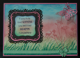
"Summer Distress"
Since I haven't bought the Summer distress inks, I used Broken China, Victorian Velvet and Bundled Sage / Pine Needles to approximate the colours, with some white acrylic paint stamping for the clouds. There are odd bits I like, for instance the gingham ribbon reminds me of summer picnics, and I'm pleased with the way the deer are hiding in the background, but the pink card really jars with me. So I'm not pleased with this effort and promise to try harder next time. Hope you are having a good weekend :-)
Ingredients:
Spellbinders: Labels one, decorative labels one, papillons
stamps: IndigoBlu & Kanban
distress ink pads
white acrylic paint
black archival ink + clear embossing powder (for sentiment)
cardstock: black, pink
Papermania capsule collection ribbon + bow
Entered for the following challenge:
Simon Says Stamp and Show... Summer Distress

Don't be so hard on yourself Maddy, your card is gorgeous. I love the scene you have created, the butterfly is gorgeous and the sentiment is so beautiful.
ReplyDeleteTake care
Hugs Sue
This is such a pretty pretty card. I love the sentiment...it's so true! I also love the blended soft colors of your background. Very nicely done to represent the grass, and colors of the sky. Love your stamping and the way you have made your sentiment...lacy layers of pretty die cuts. Love the butterfly, too! Thanks for sharing this lovely card with us at Simon Says Stamp and Show. <3 Candy
ReplyDeleteIt looks quite beautiful to me. I guess if they are colors you don't like.. you're going to be critical of it. The rest of us are saying.. great job!
ReplyDeleteI know just what you mean about the summer distress inks Maddy, I do like the hot pink one but the green is as you say quite garish. But how you use them here has toned down nicely and I love how you've added a little deer into the background.
ReplyDeleteB x