Tuesday, 23 April 2013

Colourful Card and Tissue Paper Carnations Tutorial

Hey folks, this is a big post with loads of piccies, but I've made the photos small so it shouldn't take too long to download. Anyway, there's a tutorial so it's worth it - woohoo :-)

This week, Simon Says Stamp and Show...colour! Well, I finally bought some pan pastels at the Belfast Craft show last week (had a fabby time meeting up with Lee and spending way too much, but that's another story...). I spent the weekend having a play so thought I'd share my first Pan Pastel card:

"Believe all things are possible"

This has my standard acetate tunnel construction (see project 3 on this post for tutorial). The background has blended pan pastels with stamped flowers and grasses. The clouds are done with splats of picket fence distress stain over the pan pastels. I love the effects from the shadows with this type of construction.

"Tissue paper carnations"

The flowers are all handmade from tissue paper (see later for the tissue paper carnation tutorial). You can just make out some of the background stamping in this photo.

"More flowers"

The tissue paper for these flowers was coloured with pan pastels and a large sponge. The pastels are the best thing I've ever found for colouring tissue paper!!!

"Wire leaf"

I used wire to make all these flowers' stalks, turning the other end up to make a clip to attach all the flowers to the card. Some extra pieces of wire were curled to make leaves.

"Stamped on acetate"

I love this aeroplane and banner stamp from Sam Poole's "Vintage Aviation" set. It is stamped along with the sentiment onto heatproof acetate using black archival ink and embossed in clear, then picket fence distress paint is painted onto the back of the banner with a paintbrush to make the sentiment stand out. It looks as if the plane is really flying!

"View showing construction"

This view shows the construction and different layers better. There are flowers on the background, attached to the acetate, and finally fixed to the front. The cardstock is also decorated with pan pastel flower and grass stamping but it's hard to see in the photo.

Ingredients:
Creative Expressions Sam Poole stamp set: Vintage Aviation
Creative Expressions stamp set: The Village (flower & grass stamps - thanks to my good friend Kathy who so kindly sent me this stamp set!!)
tissue paper flowers with wire stalks
Pan Pastels: Ultramarine Blue Shade, Magenta Extra Dark, Magenta & sofft tools
Versamark ink pad
Archival ink pad: Jet Black
Embossing powder: Clear, detail
Distress paint: Picket Fence
Distress stain: Picket Fence
Distress markers: Spun Sugar, Dusty Concord
cardstock: purple 300gsm, white 160gsm
tissue paper
construction wire
adhesives: PVA, glossy accents

Entered for the following challenge:
Simon Says Stamp and Show... Colour


...and here's the promised tutorial for the tissue paper carnations. For the smaller carnations, I make the stalk from wire, but the larger ones are just as good with cotton bud centres.


1. Everything you need - tissue paper, coloured marker, carnation creations dies & cotton bud

 
 2. Take a full sheet of tissue paper and fold in half


3. Fold in half again (thickness = 4 sheets)


4. Fold in half again (thickness = 8 sheets)


5. Fold in half again (thickness = 16 sheets)


6. Place on die cutting plate and arrange dies


7. Pass through roller-type die-cutting machine a few times, turning the sheet if necessary, until all the layers of tissue paper have cut through.


8. Separate the flowers, but keep the layers of tissue paper in the dies for now.


9. Take one of the flowers and carefully lift out one petal, lifting all the layers of tissue paper together.


10. Now colour the edge of the petal with the marker. You do not need to separate the layers, lifting it out of the die like this will allow all the edges to be coloured without separating them.


11. Work your way around the rest of the petals, replacing each into the die before moving onto the next one. Pop out the centre hole using a pokey tool or similar.


12. Remove the tissue paper from the die, holding all the layers together.


13. Thread a cotton bud through all the layers. You may need to wiggle it slightly to push it through. Be careful not to tear the paper. If it's too tight a squeeze, you can cut the bud from one end and thread it through that way.


14. Carefully separate the top layer of tissue paper and push to the top of the cotton bud.


15. Use the other hand to scrunch the petals up tight around the tip of the cotton bud.


16. Separate the next layer of tissue paper and push it up towards the top of the flower...


17. ...and scrunch it around the previous layer.


18. Continue separating each successive layer...


19...and scrunching the petals around the previous layer.


20. Take care with the layer separation, they can stick together,


21. but you don't need to worry about the scrunching.


22. The more uneven, the better.


23. Real flowers are never perfect!


24. And neither are mine :-)


25. Not quite finished yet, we need some glossy accents.


26. Add a drop to the base of the flower where the bottom petal touches the stalk. This will seal the petals in place and stop them falling down the stalk. Just leave it upside down to dry (I find a plastic glass useful for this). Once dry, you can fluff the flowers out a bit if you want.


I got carried away and made a whole bunch!

Tuesday, 16 April 2013

Inventor and Engineer

Did you know that in most of Europe, "Engineer" is a reserved title? You have to be properly qualified and a graduate to call yourself an Engineer. An engineer is the person who invents, designs and performs all the calculations to make sure what she has invented or designed doesn't fall apart. I love this stamp set from Sam Poole which has a fabby picture of a railway engineer.

"Railway Engineer"

The background is made by repeated stamping of the railway stamp onto black card using a suitable glue before applying gilding flakes. The card is wrapped with silver thread, then cogs are added with Pinflair.

"Background"

The cogs are made from recycled chipboard packaging, decorated with metallic distress stains, sanded and edged in Walnut Stain.

"Engineer"

The engineer and train are stamped in black archival ink onto watercolour paper and heat-embossed in clear. Distress inks and a water brush are used to add colour tints, with the edges masked using post-it notes, before matting onto black and silver card and fixing to the card with Pinflair for some extra dimension.

"Pocket Watch"

Well, the trains need to run on time don't they? The watch charm is attached to the "Engineer" topper via jump rings and a length of chain through a couple of eyelets. The eyelets are turned gold by dabbing with gold mixative ink.

"Gilding"

The faux engine plate and frame for the "Inventor" sentiment are made with gilding flakes on black card. The engine plate stamp is diecut and edged with more gilding flakes.

"Faux Rivets"

Faux rivets are added to a black mat, and the whole card matted onto more black cardstock using foam tape to make a frame.

Well, that's it for today. I hope the Sun is shining for all of you as it is here in Northern Ireland. Maddy xx

Ingredients:
Creative Expressions Sam Poole stamp set: Vintage Inventor
Spellbinders Radiant Rectangles, Petite Ovals
Sizzix Tim Holtz Gadget Gears
Ranger Metallic Distress Stains
Archival ink pad: Jet Black
Stampendous embossing powder: detail clear
Distress ink markers: Tumbled Glass, Bundled Sage, Pumice Stone
eyelets
Adirondack gold mixative
gilding flakes and glue
cardstock: smooth black 220gsm, watercolour, silver mirri
liquid pearls: pewter
watch charm, jump rings & chain

Entered for the following challenge:
Simon Says Stamp and Show: Background


Wednesday, 10 April 2013

Justrite Songbird

This fortnight's challenge on Justrite is a sketch. I thought I'd turn the whole thing back to front, so the borders are in the foreground and the main image at the back. Sheri said she'd like to see some background stamps used, and I just love this "Songbird" stamp, so thought it would be perfect for today's card.

"Songbird"

The main image is stamped onto watercolour paper with black archival ink and coloured with Derwent Inktense pencils and a water brush. Lace edge stamps are stamped in versamark onto coloured card before heat-embossing in gold, then cutting with the matching Spellbinders die. Two are made in black and two in red. The main image is matted onto red card and the lace borders adhered with Pinflair glue for some added dimension, overlapping the outer lace borders. The pinflair needs some time to try, so set it aside for half an hour before matting again onto gold and black card.

"Bow, button and stickpins"

My bessie mate Lee gave me these fabulous Oriental looking beads and I turned them into a pair of stickpins, picking the colours to go with the rest of the card. They are fixed behind the bow with some Pinflair (I use a big blob to cover the pointy end of the pins and keep them safe), and another blob of Pinflair is used to fix the button in front of the bow. This button had a shank that was removed with a pair of wire cutters so it would sit flat.

Ingredients:
Justrite stamp sets: Songbird, Classic Art Deco Lace Edges One, Large Fancy Sentiments
Dies: Spellbinders Classic Edges One
Ink pads: Ranger Archival Jet Black, Versamark clear
Colouring: Derwent Inktense Pencils, 24 set & detail water brush
Embossing powders: Stampendous Pirate Gold, Stampendous Clear Detail
Cardstock: red 300gsm, black 300gsm, gold 300gsm
Watercolour paper
Ribbon, button & handmade stickpins
Adhesives: Pinflair dimensional glue, PVA, Glossy Accents

Entered for the following challenge:
Justrite Friday Sketch Challenge 94

What? You're still here? You want more????


OK then, here are two others I made in different colourways using the same design :-)

"Sepia"

This is actually the first one I made, using just the Derwent "Willow" colouring and  Sepia archival ink pad for stamping. It gives a really soft, vintage look. The gorgeous brown / gold ribbon came from my local craft shop. I diecut a label with the sentiment for this one, but in the other two cards the sentiment is stamped straight onto the background. I prefer the simpler design.

"Teenage Girl"

I thought this fuchsia and pretty blue colour scheme would work well for a teenage girl, but it also happens to be the colour scheme my mil loves best (hello Martha!). Have a lovely, Sunny day everyone :-)

Monday, 8 April 2013

Feathered Friends

This week, Simon Says Stamp and Show...Fly. I cheered when I saw the theme. My favourite subject is nature and especially birds, so here's an Easter card.

"An Easter Card"

This card has the standard book card construction.

"Left Hand Inside Panel"

The background for both panels has strips of lace. I can't bear to throw anything away, so these were odds and ends in my lace box that were too small to use for anything else. Tim Holtz' Seasonal paper stash provided the scene in the frame. The frame is decorated with gold metallic rub-on wax.

"Chirpy"

My husband has lots of girlfriends. Don't worry, they all have feathers! He keeps pet hens and also has a couple of pet cockerels. His favourite pet cockerel is called Chirpy, and this Graphics Fairy image is the spitting image of him (Chirpy that is, not my husband :-). I printed a few copies and cut out layers to decoupage. The edge of the feathers is fringed by taking short snips with a sharp pair of scissors, and all the edges are coloured with distress markers to get rid of any white bits.

"Right Hand Inside Panel"

The pages are rubbed with more of the metallic wax to match the frame on the left hand panel. The book aperture is filled with flowers and some feathers provide extra interest. That beautiful feather peeping out at the top is from one of our Barnevelder hens. They have the most gorgeous gold tinges to their feathers. If you want to see pictures of our hens, check out my husband's blog.

"Front Cover"

The panel on the front cover was made using modelling paste and a feather stencil. Once the paste was dry, I rubbed more of the gold metallic wax onto the panel and matted it onto the front cover of the book card.

Ingredients:
Tim Holtz' paper stash: Seasonal
Graphics Fairy image
Spellbinders Antique Frame and Accents
Dreamweaver stencil - feather
modelling paste
gold metallic wax rub-on
cardstock: brown 300gsm, white 220gsm
assortment of feathers, dried flowers, paper flowers
scraps of lace
adhesives: PVA, Pinflair, Glossy Accents

Entered for the following challenge:
Simon Says Stamp and Show...Fly

Saturday, 6 April 2013

Oriental Double Inside Aperture Card Tutorial

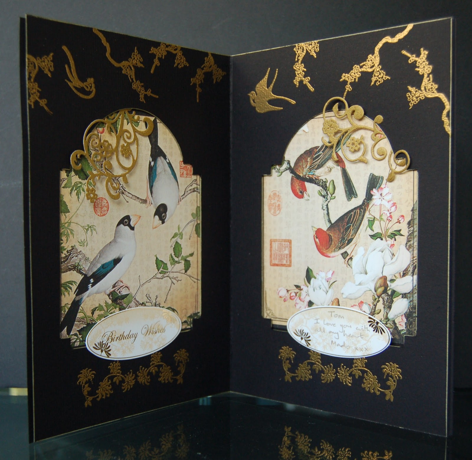
I finally found it! What? You know, the card that I made for my husband's birthday that I hid so well I lost it...

"Oriental Double Inside Aperture Card"

My husband loves birds, no not those, the feathered variety :-) I knew he'd love these panels from Graphic45's Birdsong collection and thought a double aperture card was the perfect way to showcase them.

"Fixing the patterned paper panels"

Starting off with two A4 pieces of thick card, score a double line down the centre of one of the panels (dividing it into 2 x A5 sides with a thin gutter between them). Crease both the lines to make a thin book cover, then fix the patterned paper in place with PVA and surround with double sided foam tape.

"Cutting the apertures"

If, like me, you only have one of the smaller diecutting machines, you may need to score and fold the other piece of card in half and cut both the apertures at the same time. If so, you will probably need to use a steel rule die to get a good cut (I use the Sizzix Bigz dies for this). After cutting, the card is decorated by stamping and heat-embossing in gold, then both pieces of card are lined up and joined together with the foam tape. The thin gutter helps the card to close properly, which would otherwise prove difficult because of the thickness of the foam tape.

"Adding diecut decoration"

Some flourishes are cut from antiqued gold card and fixed in place by gluing the tails beneath the aperture.

"Adding sentiment panels"

 These sentiment panels from Papermania's Oriental collection are just perfect.

"Front cover"

Another panel of the Graphic45 papers is added to the front cover, along with some Chinese characters stamped and heat-embossed in gold to wish my husband wealth, harmony, love and happiness.

Ingredients:
Graphic45 Birdsong 8" x 8" paper pad
Papermania Oriental Treasure stamp sets & sentiments
Artemio stamp set - Chinese Vases
Versamark ink pad
Stampendous embossing powder, Pirate Gold
Spellbinders Die D-Lites, Fantastic Flourish One
Sizzix Bigz M&S Vintage Cabinet die
Aquamarker, gold (for edging)
Cardstock: black 300gsm
Adhesives: PVA, Pinflair, Foam Tape


Entered for the following challenge:
Simon Says Stamp and Show...April 1...A Very Strict Challenge


Tuesday, 26 March 2013

A Box of Inspiration

Showing you this one feels a bit like baring my soul. There's a lot of me in this box, so I hope you like it.

"A box of inspiration"

There are so many gorgeous quotes stamps about, but my favourites are these from IndigoBlu.

"Let Your Soul and Spirit Fly"

This little box helps me out when I'm feeling sorry for myself.

"Love to Create"

It started out as a cheap £3 blank wooden treasure chest.

"Discover Your Passion"

It's coloured with distress stains, overstamped in archival inks, then has inked diecuts stuck on (I love this tree in the corner). The whole thing was finally coated in multiple layers of clear embossing powder. Originally, I'd intended to embed gems and seed beads into the embossing, but I changed my mind and left it like this, just inking the edges with a gold aquamarker and adding some glass pebbles for feet.

"Inside"

The inside of the box is decorated but not embossed.

"Inspiration"

And here's my inspiration... "Courage, Determination, Strength. That's What Little Girls are Made of".

Ingredients:
IndigoBlu stamp set "Discover Your Passion"
Marianne dies: Bird with Branch (small), Bird with Branch (large), tree
Distress Stains - including Tumbled Glass, Picket Fence
Distress Ink Pads - Tumbled Glass, Broken China, Chipped Sapphire, Peacock Feathers
Archival Ink Pad -  Cobalt Blue
Versamark Ink Pad
gold aquamarker
UTEE
glass pebbles
adhesives: Glossy accents, Claudine Hellmuth matt multi-medium
cheap, wooden treasure chest

Entered for the following challenges:
Simon Says Stamp and Show - Quotable
IndigoBlu - Words and Phrases

Sunday, 24 March 2013

Simon Says Stamp and Show... Water

Last Sunday was St. Patrick's day and to celebrate we spent a wonderful weekend on the Inishowen peninsula in Donegal. On the Sunday morning we drove up to the car park at Malin Head and I fished out a cheap set of watercolours and had my first go at painting.

Now Malin Head is about as remote a part of this island as you can get and Tom and I were just wondering what we were going to do about lunch when the strangest thing happened. A man with a van turned up. He opened up the side of the van and there was a state of the art espresso machine, complete with oodles of handbaked fresh cakes. Next thing, cars arrived out of nowhere and soon the whole place was buzzing. MMmmm, I can honestly say that was the best cappuchino I ever tasted, and his homemade ginger cake was glorious. Can't promise the man will be there every Sunday, but if you're ever in the area it's worth a try :-)

"Water - a Weekend in Donegal"

So back to today's card. When I saw this week's theme at SSS&S was water, I had to make use of one of my "paintings" of Donegal (I use the term in the loosest sense of the word lol!). I scanned the one I liked the best and printed it twice onto A6 card (roughly 6" x 4" for my American friends ;-)).

"View from car park at Malin Head"

What with the arrival of the coffee, I never got time to finish the painting, so my white bits were added onto the print before matting on silver and sticking to the left hand side of a book card blank.

"Lighthouse"


The other copy was overstamped with this fabulous lighthouse scene from Chocolate Baroque using archival ink and carefully lining up the horizons. I stamped a second copy of the scene onto watercolour paper and watercoloured with distress inks, cutting out the lighthouse and sailing ship and adhering over the stamped images in the print using Pinflair glue for some added dimension. Distress inks and a white gel pen were used to add colour and detail to the picture, then I gilded the whole of the foreground and the frame of the bookcard using IndigoBlu flitter glu and gilding flakes. Lastly, lashings of Pinflair dimensional glue were dribbled along the bottom of the book card and I added loads of sequins (mostly silver with a few blue), followed by more glue and lots of seed beads.

Pebbles that you pick up off the beach are always prettier when they are wet with the sea water than when you get them home and they've dried out don't you think? I hope I've captured the feeling of a wet seashore. I could add lots more to this card, but thought I'd leave this one simple for once.

Ingredients:
watercolour set and a weekend in Donegal, or you can nick my "painting" below ;-)
Chocolate Baroque stamp set: Seashore Scenes
distress ink markers (I used a lot, but including Pumice Stone and Tumbled Glass)
IndigoBlu flitter glu and Winter Dawn gilding flakes
Pinflair dimensional glue
sequins & seed beads
bailer twine for card closure
cardstock: grey 300gsm, white 220gsm, watercolour paper

"St. Patrick's day off Malin Head" by Izzwizz
My first ever painting

Entered for the following challenge:
Simon Says Stamp and Show... Water